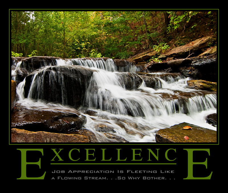
This is such a classic calendar page. No incentive here to read the text. Just to glance at a pretty picture.
I wonder why so many of the submissions used this type of graphic design. Big caps for the first and last letter of the slogan, the middle underlined for no apparent reason, the punch line ducked under ...
voted earlier
Sorry for my ignorance. You certainly stayed within the boundaries of a classic motivational poster. |







 Add photograph to your favorites
 Add photographer to your favorites


 Photographer found comment helpful.


