Author Thread Comments Made During the Challenge
Post actions
Post actions
Love the way the yellow stands out in this image. Amlost looks like a black and white photo with the yellow left remaining.
Post actions
Post actions
Right conept, but unfocused words do not make any sense.
Post actions
Post actions
A little more clarity would have helped but I like your concept and composition
Post actions
Nice. Like the DOF and crop
Post actions
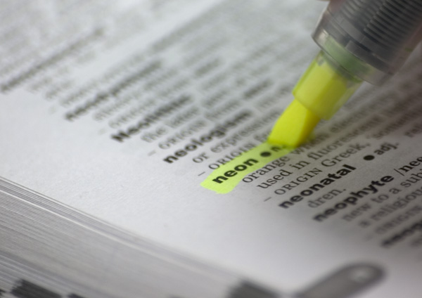
If this page had been not quite so tilted, you could have avoided having 'neonatal' so in-focus. As it is, it is in better focus than the neon of the highlighter. I find myself reading 'neonatal' rather than 'neon'
Post actions
I think this was a very clever idea. :)
Post actions
Clever idea. I think there are highlighters that look more like neon brightness, but this is well done.
Post actions
but you highlighted the dot too....
Post actions
Post actions
Post actions
If all else fails...go back to basics! Nice idea...
Post actions
Post actions
The focus feels like if centered not just on the word but also the margin of the page to the left of the word, personally I think the pic would be better if the focus would have included the tip of the highlighter (this, I feel would make the pic a bit more dynamic)
Post actions
its a bit satirical that under the word neon is 'orange' and is also very well in focus however your highlighter is yellow...





 Add photograph to your favorites
 Add photographer to your favorites


 Photographer found comment helpful.


