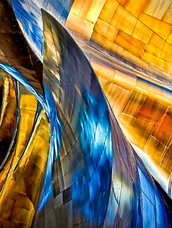
When I described this kind of processing as "Clown Vomit" to my teammates some of them were worried that was going to be the title, lol!
This isn't expanding the diversity of my portfolio and the processing (to make it look more abstract and less like an object) is a little much for my taste. But in league play it's all about creating the best scoring potential for your team and I hope this does okay for them :)
Post vote:
Wow! Thank you all for the great comments and votes. And thanks to my team the Flaming Pixels for helping me pick the right image! And thanks to Oliver for suggesting the title!
This was my third time shooting the Experience Music Project building for DPC. The two previous times were under the Basic Rule set so for this third time it was nice to have a little more freedom of processing.
This image is made from five exposures merged using the Nik HDR Pro plug-in. I did indeed push the colors a bit but the blue is definitely there for real. Not physically on the surfaces seen here, but reflected from an adjacent blue portion of the building. You just need to get the right angle to pickup the reflection and I went into work with mud on my knees one morning after getting the right angle to capture this in the bushes ;) You can really shape the look of this building using color and luminosity sliders. This is even possible with a single exposure, but I was able to get more shadow detail with bracketed exposures.
I'm very happy this was well received :)
Statistics
Place: 1 out of 182 Avg (all users): 7.1818 Avg (commenters): 8.8125 Avg (participants): 6.8765 Avg (non-participants): 7.8000 Views since voting: 3941 Views during voting: 248 Votes: 121 Comments: 45 Favorites: 11 (view)
It is a beautiful image .. but them again, I remember your other entry using this building and loved it as well .. super congrats on building on what you know and improving it AND scoring a blue.
This is just lovely, sadly it is quite identifiable, which I hope does not cost it a place on the front page, because however it does in this challenge, it is a stunning addition to your portfolio.
Seen this structure plenty lately :) ....but, I'm not that bored of it yet. Love it as much as I did the last time. The colors and tones on this are exceptionally nice....would love to know how you've processed this. Topaz Adjust?
Very nice, awesome in fact and should do well. To be honest, however, for me it suffers a little from the "seen it before" effect. Not like I haven't ever milked a good subject. Glass houses you know...






 Blue Inclination
 Add photograph to your favorites
 Add photographer to your favorites

 Photographer found comment helpful.


