Thank you for all the great votes and comments, I am very pleased about this result. It is so hard to score well these days!
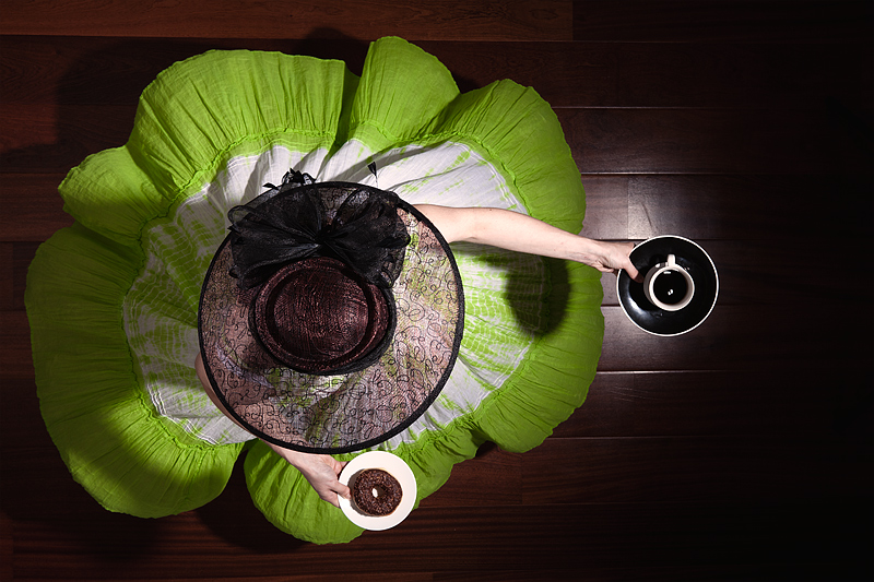
The execution was quite interesting to achieve. To summarize it, my wife had to do a fast 180 degrees rotation (so that the dress would lift up), while holding the coffee and the doughnut, and ending the gesture at the right place. This was done in a corridor where I was able to stand from above, and the walls were quite near on the sides: positioning needed to be precise.
Some fun facts: the coffee cup was glued to avoid it flying away (but the coffee is real), and we built a structure under the dress to help it lift up. The doughnut is real too... well, it was ;-)
ETA: A little comment about the light and shadows: I do know about the harshness of these, of course. I did not find a better way to create a vignette (i.e. much less light on floor than on the girl) without being directional with my main source. There is some fill light behind the subject too to help in that regard. The rest would have been easy to fix under advanced editing rules, but this is the best I was able to achieve in the basic rule-set.
Statistics
Place: 1 out of 174 Avg (all users): 7.1364 Avg (commenters): 8.1875 Avg (participants): 7.0000 Avg (non-participants): 7.2165 Views since voting: 6337 Views during voting: 327 Votes: 154 Comments: 54 Favorites: 13 (view)
This is the second visual that has stayed with me for quite some time. Regardless of the imperfections you mentioned the strength of the playfulness and the strong study of shapes overcomes all that. I love the many circles from the spinning dress to the hat to the plates, coffee cup and doughnut. The mood is one of mirth - it is playful and inviting. The hostess does a joyful dance that I cannot help but join her invitation to partake in coffee and a doughnut.
I perceive minimal or basic editing as the "easy way". I mean, anyone can take a technically decent photo with nowadays' gear. Even my mother does (sometimes ;)) Any camera embeds chips that will compute for you some decent settings. If the result doesn't look good, well, you still captured the "reality as it is", and consequently, you can blame it on the environment (too much clouds, not enough sun, too much sun, subject wouldn't stand still, nothing happened that day, that lens sucks, etc.) I do know this is not entirely the truth, and great photographers will still usually find a way to snap good shots in, no matter what. But if you fail, you still has that little voice in the head telling you it's not entirely your fault.
As a contrary, under expert editing rules, you are in control of everything, literally. If the result is poor, then you are the sole responsible for it. In that sense, "expert editing" pushes me way more out of my comfort zone. While anyone can take a decent photo (not necessarily fabulous, just decent), a decent photoshop collage is another story: it takes much more time for everything: figuring out a working composition, shooting the elements, masking, adjusting all the colours and lights... We all saw some pictures that are a complete failure in that regard. It's much easier to produce a bad photoshop work than a bad photo. I believe you really need some solid photo skills to try and achieve nice photoshop work (unless you are a pure digital painter and draws everything from scratch, but that's yet another thing).
To conclude, yes you are right, some of my massively photoshoped entries have less impact that this photo. For me, it just means I should work harder on them: it's still a way to produce images that non-edited photos cannot. Since I do love unrealistic and imaginative pictures, I find these modern techniques very interesting, and logically, intend to get better at them.
Lovely insight, Christophe. Thank you for posting!
Although my limited and non-artistic eye often struggles to connect with the depth of your imagery, I have to say that I truly admire your wife! You are tremendously lucky to have her support, and I hope you take the time out of your busy image editing and regular working schedule to spend some time appreciating how special and lovely she must be! ;-)
I wonder whether an image like this pushes you more out of your comfort zone than an image under expert editing where you can create whatever you'd like under the time restraint? To me, this image speaks greater to me about your phenomenal talent as a photographer than some of your very ambitious and complex expert editing submissions. This just has so much more meaning and impact, visually, in my honest opinion.
Thanks a lot for your kind words. I value your opinion a lot, and in a sense I agree with you, even if my view on the subject is quite different.
I perceive minimal or basic editing as the "easy way". I mean, anyone can take a technically decent photo with nowadays' gear. Even my mother does (sometimes ;)) Any camera embeds chips that will compute for you some decent settings. If the result doesn't look good, well, you still captured the "reality as it is", and consequently, you can blame it on the environment (too much clouds, not enough sun, too much sun, subject wouldn't stand still, nothing happened that day, that lens sucks, etc.) I do know this is not entirely the truth, and great photographers will still usually find a way to snap good shots in, no matter what. But if you fail, you still has that little voice in the head telling you it's not entirely your fault.
As a contrary, under expert editing rules, you are in control of everything, literally. If the result is poor, then you are the sole responsible for it. In that sense, "expert editing" pushes me way more out of my comfort zone. While anyone can take a decent photo (not necessarily fabulous, just decent), a decent photoshop collage is another story: it takes much more time for everything: figuring out a working composition, shooting the elements, masking, adjusting all the colours and lights... We all saw some pictures that are a complete failure in that regard. It's much easier to produce a bad photoshop work than a bad photo. I believe you really need some solid photo skills to try and achieve nice photoshop work (unless you are a pure digital painter and draws everything from scratch, but that's yet another thing).
To conclude, yes you are right, some of my massively photoshoped entries have less impact that this photo. For me, it just means I should work harder on them: it's still a way to produce images that non-edited photos cannot. Since I do love unrealistic and imaginative pictures, I find these modern techniques very interesting, and logically, intend to get better at them.
I wonder whether an image like this pushes you more out of your comfort zone than an image under expert editing where you can create whatever you'd like under the time restraint? To me, this image speaks greater to me about your phenomenal talent as a photographer than some of your very ambitious and complex expert editing submissions. This just has so much more meaning and impact, visually, in my honest opinion.
A reposte to ubique's shadow comment:
Shadows are fine but I simply felt there was inconsistency between the shadow on the floor and that on the dress, and I did not think this felt... I wouldn't have commented had i thought they were of the same darkness... does that make sense?
Which is not to take away from your great image and result. It was hard to not see this come up o the front page. Great image.
I love it, Christophe, the colors, the shapes, the SHADOWS :-) And I especially love that two commenters thought this was mine, LOL!!! Congrats on the well-deserved blue.
Cristophe, this is for me clearly the best picture that you have submitted to DPC. While I have admired the skill and commitment of your more overtly orchestrated works, they haven't been to my taste (though the fact that they are so widely celebrated suggests that that's my problem, and not yours!) But this one I have the double pleasure of both admiring and liking, very much indeed. Thank you.
As for the couple of comments lamenting the shadows, I cannot agree. The real world has shadows. The fact that you could 'spoil' this beautifully constructed whimsy with a cold splash of shadows testifies to your humour as well as your style.
I can't help thinking a cross between Alice in Wonderland and Lady Ga Ga - super lighting, great colours lovely comp and the three sets of circles work very well for me
I like a lot of things about this shot. The recurring dark circles of the hat, doughnut and coffee saucer are great. It really makes me wonder who is so flamboyantly being served some Dunkin Donuts :) My only criticism is that the shadows behind her and below the saucer are a little harsh. Perhaps some fill flash would have helped. 9.
How beautiful! I love the use of color! Oooh, and her hat! And her dress! And COFFEE!?!?!?!
Oh my. So lovely! Every aspect of this photo appeals to me in absolutely every possible way! Simply delightful! Will you be my new best friend??????????
An ambitious shot. But something is lost. Perhaps too much information, too many circles. Maybe one arm would have been enough or a smaller hat .... perhaps more floor space would have helped or a tighter crop ...
It's a bit unfair on how we mark pictures. Sometimes the same mark is applied to wildly different quality of shots.





 Doughnut Girl
 Add photograph to your favorites
 Add photographer to your favorites

 Photographer found comment helpful.


