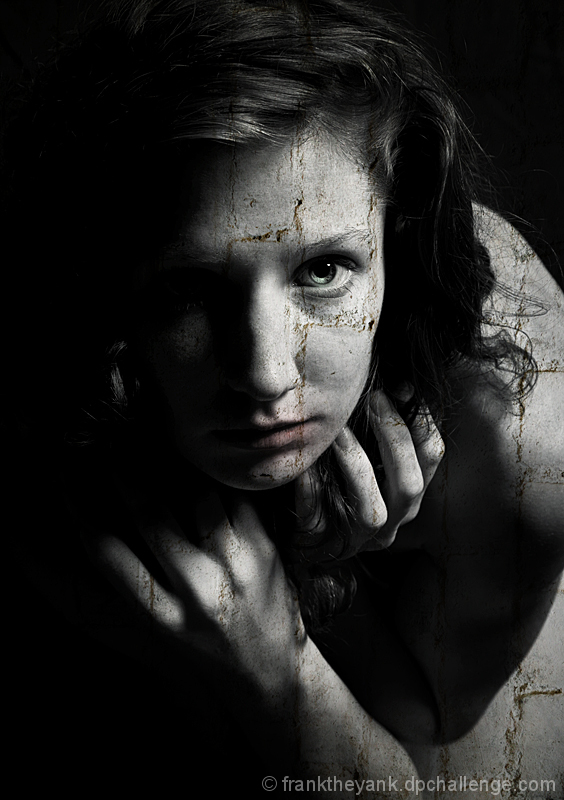
I like the whole image EXCEPT the bottom right. I think you could have gotten rid of that part of the overlay and it would have made it better.
It has a great mood though. I love the deep colors. Her eyes..erm..eye.. is gorgeous too. Lol. ;)
Giving this an 8 but could have been a 9 or 10 with the bottom right fixed.
A stunning portrait on its own. I'm not quite sold on the overlay - I'd like it better without it, I suspect. But I still think the underlying photograph is awesome.
What a wonderful job you've done on this one. Really captures an essence. I wish that they'd do more expert editing challenges to see this type of work. :)
Someone commented on mine, that my model was kind of scary looking! :P but then, this one must have terrorized him/her :P
I dont like the fact that you just put a wall texture over her, dont know... havent been a fan of this technique, and used very little if any myself. (though this is better than most of the entries and I predict it to be a Top 10 almost guaranteed!)
Will love to see other photos with this model, as I believe she is better looking than what we can see here.
Beautiful image with great lighting, but I don't know how this particular texture of bricks rotated 90 degrees adds to the image. I end up spending too much time trying to figure out what you meant using such a strong graphic element and can't resolve it. Either leave them un-rotated, and the bricked in/ walled off metaphor works, or dirty up the layer so it is just a graphic element stripped of possible meaning. It is a minor point, but it detracts attention from a well lit,well posed and beautifully handled post processed shot.
Nicely done. I wish that the filter was less visible and would look more like a veil. I would have erased it on the arm. This being said, I much appreciate the picture, the pose, the idea of a hard lived life, the temerity of it, the coloring.






 Add photograph to your favorites
 Add photographer to your favorites

 Photographer found comment helpful.