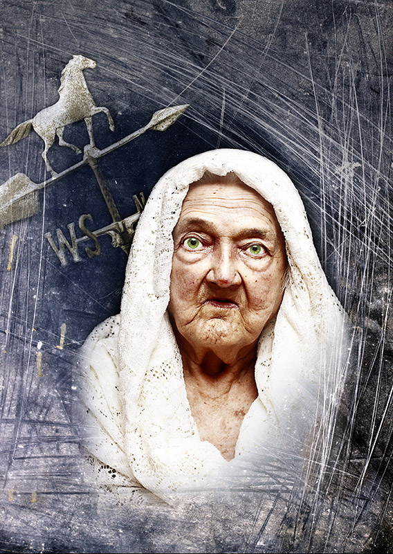
This is my grandmother...a terrible picture of my grandmother. I edited the picture to make her look much older and weathered than she really looks.
Three images were used to make this:
- Grandmother (camera settings are for this shot)
- Weather vane
- Texture: scratched plexiglass with the sky reflected in it
Nothing too exciting happened in the editing. Mostly just work with layer masks and some curves.
As for the meaning, the title refers to death, of course, as many figured out. The weather vane represents change, and it also points toward the sky. The scratches are mostly there for mood and as something to frame the image with, but life (and death) does bang you up pretty good, so it could add that meaning too. I was originally going to add an old pocket watch in the upper right corner, but I ran out of time to shoot. I worried that the watch would make the image too cluttered, which one of my WPL teammates mentioned as well.
Statistics
Place: 9 out of 49 Avg (all users): 6.5143 Avg (commenters): 7.7500 Avg (participants): 5.7778 Avg (non-participants): 6.6486 Views since voting: 2111 Views during voting: 426 Votes: 175 Comments: 20 Favorites: 2 (view)
This I do like pretty much!.. Could be in top3, if mine doesnt get a ribbon. so I prefer that you score at best a 4th position (so I can be in top3) :P
The fact that this isn't head and shoulders above the crowd is a testament to how good the top ten is in this challenge. Strong idea, well executed with good textures. My only knock is that the lace around the model's head is a bit blown. Normally that would be fine to get the skin tones in her face, but in this rule set you could have layered in a darker shawl and gotten that detail and pushed the eye more strongly to the face. Ought to ribbon.






 Add photograph to your favorites
 Add photographer to your favorites

 Photographer found comment helpful.


