I agree with the comments below. It simply is a sharp image that dosen't grab your attention.
I think that if the DOF was increased and maybe playing with the contrast a bit to help it jump out of the photo.
Maybe using a board behind the photo would help centre the attention as well. BTW I gave you a 5 met the challenge.
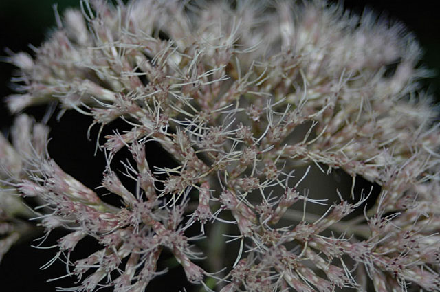
I agree with Frisca - I actually love your framing of the subject, plus it's tack sharp. But the underexposure hurts it. If the lights were brightened up a bit, it would really "pop"!
hey -- I noticed you thought you needed more feedback on why this image was not very favourably received.
I didn't vote on this, but if I did, I probably would have given it a 4 or a 5. The image seems a bit underexposed and that is really muting any effect. I think the close crop/full frame is fine, but the colours don't pop and there is nothing to grab attention. The background is dark and I think that when coupled with the dull colours of the flower, its all just a bit bland. Maybe if you had the flower with a different bg or some context to give it a bit of a "story" Its hard to say, but I think the bottom line is...there just isn't much there to hold attention.
This is a nice capture, but it is really flat colorwise and doesn't grab attention because of that. I am unsure how you would make this more vibrant, perhaps at a different time of day or with a different light source, some more of the pink and green could be brought out.





 Add photograph to your favorites
 Add photographer to your favorites

 Photographer found comment helpful.


