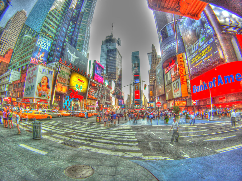
One of the ways I judge images and vote is as follows: do I think the processing effect lends itself well to the image?
In this case the answer is no. I would have loved to have seen this with subtler processing with perhaps the liberal saturation boost that is here if that's what you're looking for. I think a strong sharp contrasted image would have scored much better.
However, this is just my opinion. I don't know what you were trying to achieve. If it was this you did it excellently. I really do like the perspective used here.
FWIW, this image strikes me more as digital art than a photograph. There are lots of cool elements here and it does like an interesting photo, with the fisheye and long exposure etc.
Keep up the good work, just go easy on the HDR! :-)
I feel that with a different name like "Crazy Colors" this photo would have done better. I over processed it on purpose to exaggerate the colors of times square. Snce I entered this photo I have gotten lots of comments from people who either love it or hate it. Next time I know DPC is a more true to the art contest. Thanks for all of the comments and votes.
Depending on how you define "success", you got feedback as to whether folks love it or hate it, a fair amount of comments. I would say this was a successful pic. Just my humble opinion though :)
I feel that with a different name like "Crazy Colors" this photo would have done better. I over processed it on purpose to exaggerate the colors of times square. Snce I entered this photo I have gotten lots of comments from people who either love it or hate it. Next time I know DPC is a more true to the art contest. Thanks for all of the comments and votes.
From a subjective point of view, much too overdone in the post-processing. From a technical, issues with haloing around the buildings and excessive noise in some areas. Composition is fine, although as presented the ultra bright red to the right dominates. A photo worth revisiting, I feel.






 Add photograph to your favorites
 Add photographer to your favorites


 Photographer found comment helpful.


