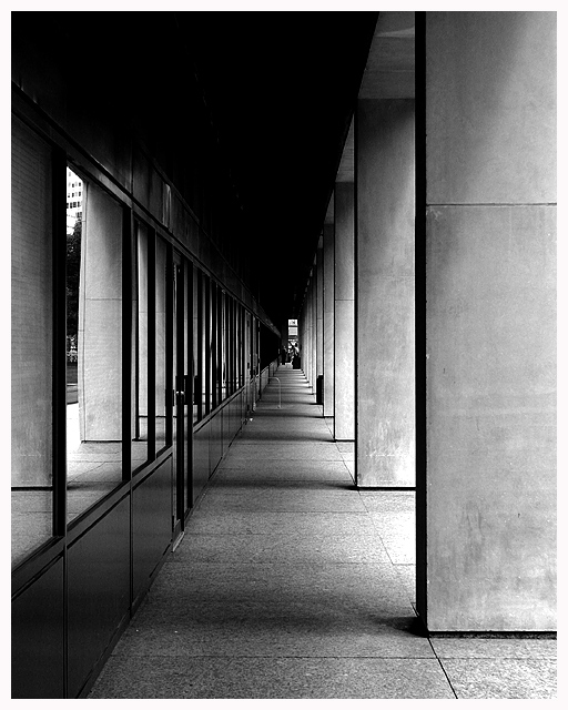
Great use of light and shadow! Having just viewed a somewhat similar image (colonnade at side of building) which I felt was too centred I know find one where the centred composition works very strongly. Perhaps because, although the end point is centred, the image retains a strong sense of asymmetry. That's down to the full floor to ceiling nature of the pillars at the right and the reduced height of detail on the left.
great perspective, great texture rendition. I especially like the way you've composed the shot to make sure that shifting the gaze from left to right at the far end of the corridor gives the illusion of looking at closer objects.






 Add photograph to your favorites
 Add photographer to your favorites


 Photographer found comment helpful.


