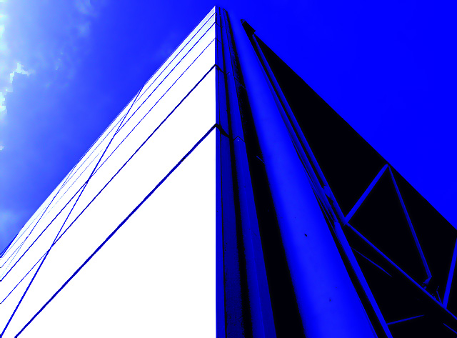
Taken on a hike to the University of East Anglia to shoot the dorms for the vanishing points challenge. In the end this shot of the stage at the UEA more closely fitted the challenge. I'm putting my money on this being my highest scoring sho at dpc :)
Lightly cropped using layers to boost the already blue shot but could nothing about the jagged lines.
Statistics
Place: 134 out of 245 Avg (all users): 5.1118 Avg (commenters): 5.3750 Avg (participants): 5.0859 Avg (non-participants): 5.1307 Views since voting: 1146 Views during voting: 389 Votes: 304 Comments: 12 Favorites: 0
It has taken us a scant five years to get to your photo, but at long last the Critique Club has dredged it back up. Being a member has its perks, I guess :)
Your entry was quite fitting for the challenge, with strong leading lines and a menacing façade that stretches off seemingly forever. The centered composition is alright, though I think I would prefer either a symmetrical approach or an uncentered composition. One thing that might have made this quite interesting visually, and likely made it border on an abstraction, would be to have shot the photo in a landscape format and then positioned the tip of the structure at the edge, but uncentered. Not necessarily on the thirds, but just so that it wasn’t centered. This would almost give the impression of a long hallway if you used the white portion for it, and the dark side would have been equally obscure looking.
As others noted, the blue is a bit intense for my taste, as well, and as you noted, you’ve got some aliasing going on there. We’ll blame that on antiquated software compression algorithms ;)
I can’t make up my mind how I feel about the fragment of cloud on the left. It’s interesting in that it seems very much like an element from an impressionist painting due to the way that it is so saturated and distinct, having very little transition of tone. The shape helps this effect too. But then it also seems a bit distracting… but balances out that side, which is lower. Like I said, can’t make up my mind.
As an aside, it’s kinda neat to get such an old image for CC, especially for a still active member. Seeing the evolution is definitely encouraging. It’s also interesting because it really shows how comparatively short a time I’ve spent here.
-Derek
I hope you didn't lose your shirt on this one...LOL your comment says " I'm putting my money on this being my highest scoring sho at dpc :"
Well you kicked my butt...I tried to stay away from the obvious VP too but it got trashed. The blue is a little over processed as you already know from the other comments. I think you composition is a little too centered the triangular shapes to the right are distracting. Positioning your shot a third to the right would eliminated these shapes bringing the blue lines from the left into focal points (rule of thirds)and also allowing for more detail from the clouds in the sky. But a great subject none the less.
Excellent abstract image. The blue just makes it really stand out. I think that the clouds on the right hand corner disrupts the great shapes presented. "9"
This looks like a candidate for neon, I feel that the screaming blue color against the screaming white makes it a little uncomfortable to look at, but the clouds in the sky in the upper left corner is almost the only details here, good composition would like to see it with more details, Good luck





 Add photograph to your favorites
 Add photographer to your favorites

 Photographer found comment helpful.


