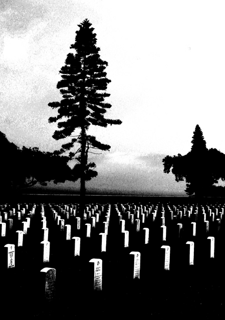
Adjusted levels, then adjusted bright and contrast to achieve this effect. Probably too "arty" for the DPC audience, but I like it and hope to get some good constructive criticism!
Statistics
Place: 170 out of 245 Avg (all users): 4.9097 Avg (commenters): 5.6667 Avg (participants): 4.7786 Avg (non-participants): 5.0056 Views since voting: 752 Views during voting: 389 Votes: 310 Comments: 14 Favorites: 0
I like the idea a lot, but don't care for a lot of the choices you made. I don't like the excessive contrast or the grain. I imagine you probably them both to add to the statement of the photo, but they just don't move me.
I like the idea, but the contrast level is a tad high. You loose too many of the midarea names on the tombstones. A light burn in so you could see the names on the 2-5 stones in the second row might help.
I like this effect but, speaking as one who has been punished for overprocessing in the past, I wonder if the processing has been taken a bit too far in this case. I think the contrast is a little too strong at the bottom and the graininess too patchy at the top. How about if you had filled the frame more with the gravestones?
I understand completely where you are going with this and it has the potential to be outstanding. I'm sure you are probably having lots of comments about the graininess, which I'm sure the time of day had a lot to do with that, you might want to try using neat image on it. It will help smooth out the graininess.
too much of contrast ?? this adds noise to your photo as you can see on the top left side
need a little more balanced levels .. black and white works good though
This is one of those odd little shots that I like. Unfortunatly though I'm sure your score is suffering from being creative. Good luck. Fight the power.






 Add photograph to your favorites
 Add photographer to your favorites


 Photographer found comment helpful.


