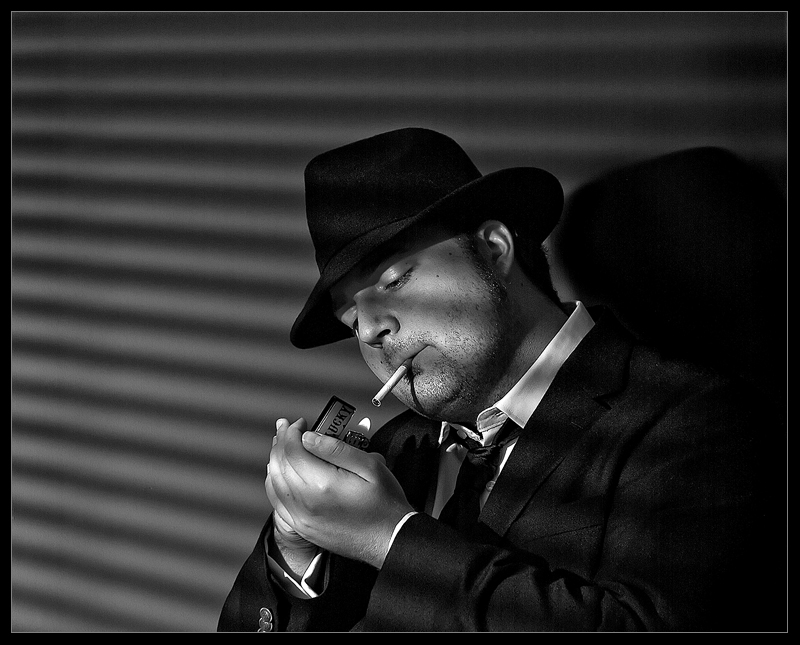
I would have givien a higher mark if the composition was cropped in a bit so there was not as much dead space at the top of the image. He is too centered for my liking.
Why not crop this down to a proper old movie aspect ratio? There's too much space on top anyway. And a major pain is that I don't remember any elegant frames on old movies. OK its a particular bugaboo of mine hating borders anyway but here it is totally contrary to the topic. Still a 6 although I wanted to giv e a 7 for good mood and execution. It's just not right for the reasons mentioned. My entry to this challenge is terrible and I know it but I had no time to stage something like this. Too bad this misses solely on compisitional grounds.






 Add photograph to your favorites
 Add photographer to your favorites

 Photographer found comment helpful.


