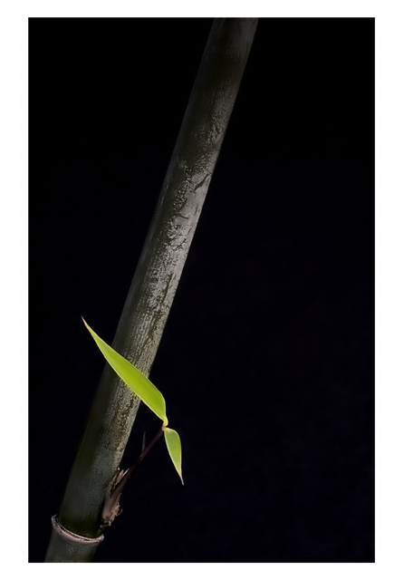
Stick of bamboo from the garden.
Lit from a window and a suplemental spot from above and to the right. Stuck the bamboo in the sock drawer to hold it, used a sheet of black card 8 inches behind bamboo as backdrop
Canon 10d with 100mm f2.8 macro lens on tripod with cable release. f32 used to gain max dof
PS work:
Curves and levels to get the black point
Added a grad black layer to lose the top of the bamboo, with a 80% opaque setting
Selected inverse of green channel and desaturated a little to make leaves have impact
Selected green channel and increased saturation and lightness to really make the leaves zing
soft dodge/burn to lose the back edge of the bamboo in the background and loose the ends of the main stalk a little more
flattened image
sharpened with USM
neat image to very slightly smooth the leaves, but tried to keep the texture on the bamboo stem
tweaked the saturation and contrast again and again until I was satisfied (7 attempts)
File Name CRW_7671.CRW
Camera Model Name Canon EOS 10D
Shooting Date/Time 09/08/2004 13:12:40
Shooting Mode Aperture-Priority AE
Tv( Shutter Speed ) 8
Av( Aperture Value ) 32
Metering Mode Partial
Exposure Compensation -1 1/2
ISO Speed 100
Lens 100.0mm
Focal Length 100.0mm
Image Size 3072x2048
Image Quality RAW
Flash Off
White Balance Auto
AF Mode Manual Focus
Parameters Contrast Normal
Sharpness Normal
Color saturation Normal
Color tone Normal
Color Space Adobe RGB
File Size 4888KB
Statistics
Place: 16 out of 215 Avg (all users): 6.3670 Avg (commenters): 8.1875 Avg (participants): 6.1157 Avg (non-participants): 6.8209 Views since voting: 1707 Views during voting: 311 Votes: 188 Comments: 19 Favorites: 7 (view)
A very beautiful minimalistic and artistic image with an oriental feel, but doesn't meet the challenge, imo. Perhaps a bit more saturation of the green leaves?
I'm always a sucker for the simple and understated, and you've produced a very fine entry here. I love the pristine black background, and the angles you've created, and the use of negative space. I'd like to see the lone leaves a bit closer and more detailed though. Since they're clearly the subject of interest that draws the eye, they leave me feeling a bit empty because there's not much to study or hold my attention. I think the wide white frame is a little bit overkill too. A simple white line would have broadcast elegance. Great submission, but could have been much stronger, IMO.
Whew! I almost did the same kind of shot before picking another plant!
Simplicity is what makes this shot so beautiful. Simplicity and, composition, lighting, focus, correct exposure ... you nailed it. Excellent image.
Simple - and very effective. Black background is perfect. Composition could not be better. Title is imaginative - but where is the am/pm indicator? (I wonder if some won't even notice the "clock hands"!) The border is just "ok" - think it should either be a uniform width - or if not, larger at the base only. Try it with a much thinner, uniform frame. Should finish well up in the pack - I really like it.





 Add photograph to your favorites
 Add photographer to your favorites

 Photographer found comment helpful.


