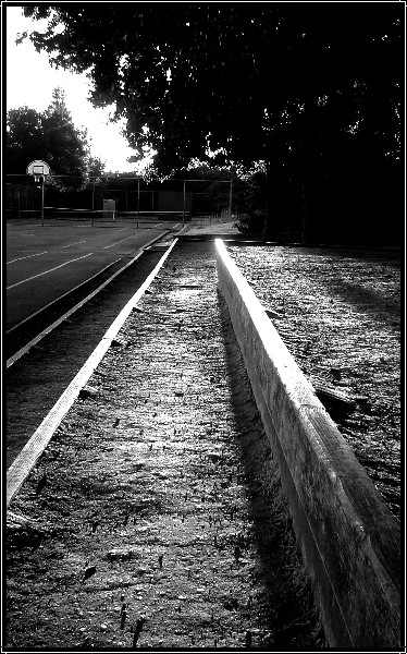
I love the brightness on the top of the wall - but I feel that the tree and sky in the top of the picture distract from the wall and the interesting textures of the foreground.
Nice lights and original setting. I love the added contrast. Maybe a little overexposed, you could have gotten rid of highlights towards the centre of the image by reducing the exposure. Your sky would have gained from this too.






 Add photograph to your favorites
 Add photographer to your favorites


 Photographer found comment helpful.
