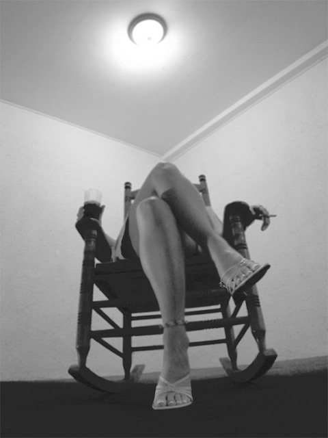
Beautiful legs! but pic could use some more contrast. Better not to shoot straight into the light source. I like the wide angle distortion to emphasize the legs and feet.
I really like the point of view here although I wish there was slightly more space between the upper knee and where the ceiling moulding comes to a corner. The pose and the lighting are also very nice. the tomes are too flat for my tastes though - I'd like to see more punch from darker black tones. The "horizon" line of the floor looks crooked to me, but that might have been intentional given the camera angle.
This just strikes me as a sad picture. The fuzzy focus is ok because it adds the the mood. I like the repeating angles of the ceiling and her legs and the straps of her shoes. Strange, the exclusion of her head. It makes it seem even more sad. The slant looks accidental and I would have straightened it.
Interesting...something about the lone bare walls and the single light, kind of old timey. I wish it were a little bit less fuzzy though. Keeps a 8 to a 6







 Add photograph to your favorites
 Add photographer to your favorites

 Photographer found comment helpful.


