Author Thread Comments Made During the Challenge
Post actions
Post actions
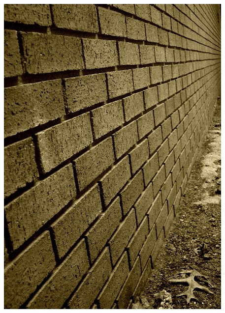
Simple but great!!! The leaf at the front makes it more interesting.
Post actions
good but make it on both side wall , long through ,....
Post actions
The sepia (or duotone?) is great for this shot! I also like the texture of the bricks in the foreground.
Post actions
This is the kind of thing I used to do in tenth grade photographty class for subjects like, texture, perspective. It's good, but unimaginative.
Post actions
i usually gave a low score for images without a clear vanishing point but somehow i love this one. the colours, the detail on the wall and ground. the shadowy look on the side is a bit distracting, still, count me in as an admirer! 7
Post actions
Post actions
Post actions
I like the texture of the wall. Good execution. 8
Post actions
I'm sorry but that leaf in the bottom took all my attention. Nice picture though.
Post actions
Post actions
very creative! i like the sepia tones and the mood it gives off, and the leaf on the lower right is a good addition. 9
Post actions
You have created an ambiance out of a brick wall by breaking from convention. Bravo! One of my favorites in the challenge. The lines are so powerful in this. 10






 Add photograph to your favorites
 Add photographer to your favorites


 Photographer found comment helpful.


