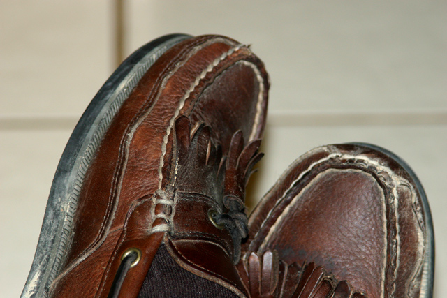
Unfortunately, I have to agree with some of your commenters at the lack of interest in the subject of your shot. They are shoes and sometimes simplicity is very effective but unfortunately not in this situation. This is partially due to the crop which is a little bit unflattering leaving only the tops of your shoes.
The focus on the right shoe (crossed over so on the left side of the frame) is good. The DOF is deep enough to get some of the other shoe in focus which works nicely and it is also shallow enough to blur the background. The exposure is also done nicely, although the shadows could have been a tad brighter.
Overall, I believe that this image suffered from the lack of interest in it seen by the voters. In the future, it might be good to ask those around you for their input as everyday people. They'll tell you flat out if it is appealing or not. So this is a below average shot for you but we all make mistakes so better luck next time.
If you have any questions comments are concerns feel free to PM me.
please forgive the brevity/abruptness of this comment, but I find the lighting to be harsh and the crop doesn't really give us a story as to how these shoes got this way or why its interesting/important that they are.
boring: the lighting should be focusing on the shoes, or there should be shadows or the leather should have more gleaming depth - and the blurred grid of the tiles seems unnecessary





 Add photograph to your favorites
 Add photographer to your favorites

 Photographer found comment helpful.


