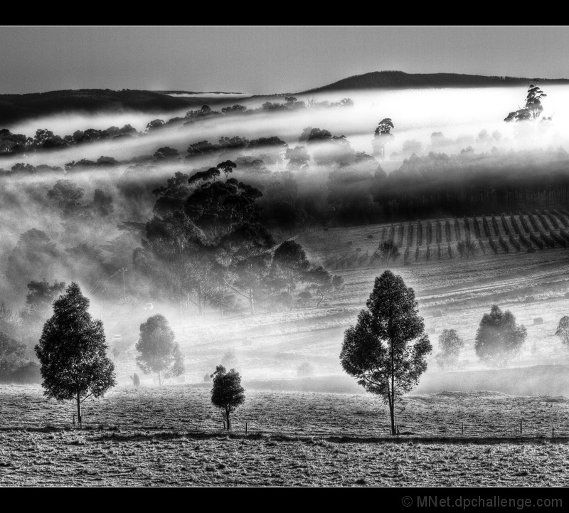
Last minute entry. Color PP not quite right hence B&W.
[Jul. 27th, 2011 02:32:43 PM]
Yes, I agree, the title was not the best either ;) Nor was the border. I should have given it more thought but the time beat me.
[Jul. 27th, 2011 06:06:56 PM]
7.02 at 50! UNREAL!
[Jul. 27th, 2011 06:15:02 PM]
PP - single image HDR in Photomatix using my Fog preset with adjustments, LR3 for Clarity, Curves, Detail (noise, sharpness), +Saturation on Orange (that made the yellow in the grass lighter). I did not like the colors so I just did -100 on Saturation in LR3 for a rather surprising result. Added border on Export. Ran out of time!
[Jul. 30th, 2011 05:25:30 PM]
7.13 at 100.
[Aug. 2nd, 2011 12:59:00 PM]
7.2 at 140 - is it a ribbon??
Statistics
Place: 1 out of 62 Avg (all users): 7.2516 Avg (commenters): 7.9231 Avg (participants): 7.1515 Avg (non-participants): 7.2778 Views since voting: 4949 Views during voting: 274 Votes: 159 Comments: 32 Favorites: 8 (view)
Congratulations .. it is a tranquil scene and you composed it amazingly and photographed it perfectly - I think b&w was the best choice regardless of why you choose it.
damn! :D i spent the week hoping that maybe, just maybe 7.11 would be enough for first! well if im gonna get pipped, its best done by margaretN! well done!
Beautiful! I hope this ribbons.
The harsh shadows in the foreground are a little too contrasty to give the sense of tranquility, but everything else in the picture does. Maybe if the picture were cropped from the bottom slightly to remove the shadows, it would look even better?
A stunning capture and love the Mono. You get one of my highest votes. Only nit is the cars on the bottom left as this breaks that getaway feel that this image has. The calmness and the mood in this





 Sense of Tranquility
 Add photograph to your favorites
 Add photographer to your favorites

 Photographer found comment helpful.


