|
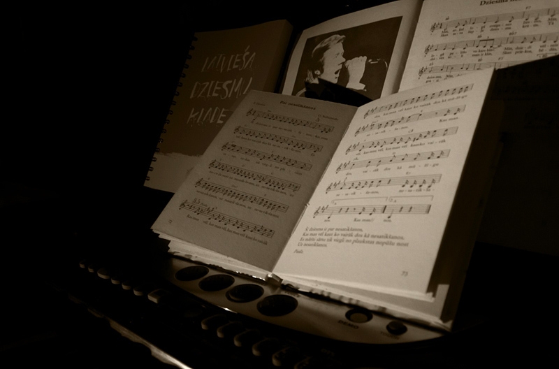
I would have liked to have seen both pages of the foreground book in focus. The books in the background could have been blurry. Compositionally, the title at the top of the page, it is distracting being cut off like that, try either not showing it, or including the whole title. When you adjust the top, leave the bottom of the image - it is cropped perfectly. |






 Add photograph to your favorites
 Add photographer to your favorites


 Photographer found comment helpful.


