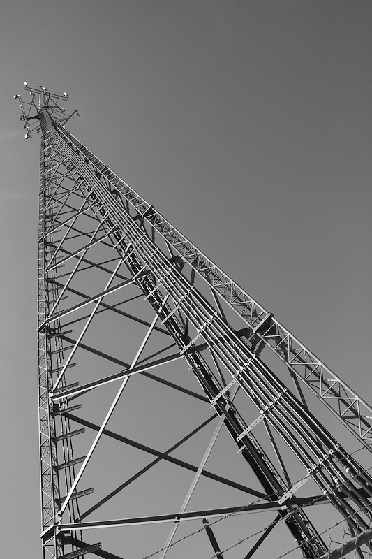
I think this image has a dynamic composition, with a nice pattern, that is just way too gray. Black and white images do well when they have a good range, from pure whites to pure blacks. This image seems to be centralized around mid-gray. Upping the contrast here would have made a world of a difference to this image. Hope this helps.
WHOOPS, I just realized that this is minimal editing. I take everything back and am bumping up the score. Sorry about that. |








 Add photograph to your favorites
 Add photographer to your favorites

