Since I ended up with about an hour to shoot this, I just HAD to do something related to my own "tutorial" (though I have a better and later example here in the Hou-To section). There's also another good (better) tutorial on the same subject (masks); my example also uses Curves Adjustment Layers, which are covered in this tutorial.
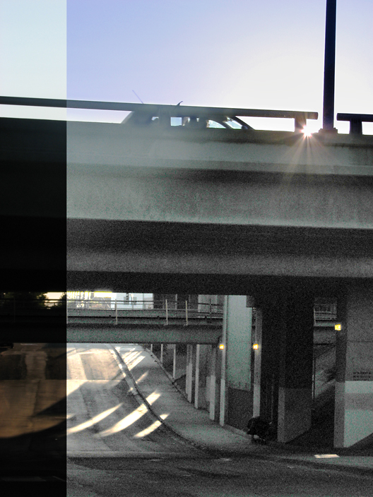
Problem: How to see dark, shadowed area under freeway while shooting into the sun.
Solution: Graduated masks for lower area and sky, with RGB and Blue channel Curves adjustment layers applied separately to each. After "balancing" the tones I applied another RGB Curve to the composite image.
After this, I resized and applied the UnSharp Mask filter with both "high-radius" and "normal" settings.
Vertical strip to the left remains unadjusted, to show that the original image looks like.
I deliberately took a "bad" and "extreme" original to demonstrate the degree to which an image can be altered, and how much information can be recovered if no alternative image is available. However, the technique can certainly also be used for more subtle adjustments ... :-)
Disqualification Details
You may not use ANY editing tool to create new image area, objects or features (such as lens flare or motion) that didn't already exist in your original capture.
Statistics
Views since voting: 644 Views during voting: 257 Comments: 7 Favorites: 0
Is the left part of the photograph also part of the tutorial? I think I'm missing the point, but this will surely get clear when visualizing the tutorial.
I do like how you’ve demonstrated the difference between having the tutorial and not, but in this case didn’t think the image you have used is particularly well suited in an artistic sense. The place where the split happens doesn’t seem to have a reason; acts only as distraction. Possibly something with two distinct sides having the processed side complimenting the other side might have been more effective? I do like the final result of the processed side; makes for a more interesting and arty image and it does demonstrate how effective and creative such processing can be. Just a pity the split is so jarring. In two minds about the composition too; I love the little glint of sunlight at the top, but think possibly would have been more satisfying if you made it squarer by cutting off the top midway up the side of the bridge (i.e. no car, barrier or sky).
My First Weighted Scoring System ™; composition + technical 2/3, challenge* 1/1, post processing results 1.5/2, ooooh factor 1.5/3, originality 0.5/1 =6.5, rounded to 7 (* I don’t think it’s possible to not meet the challenge on this one so everyone gets a 1/1)





 Add photograph to your favorites
 Add photographer to your favorites

 Photographer found comment helpful.


