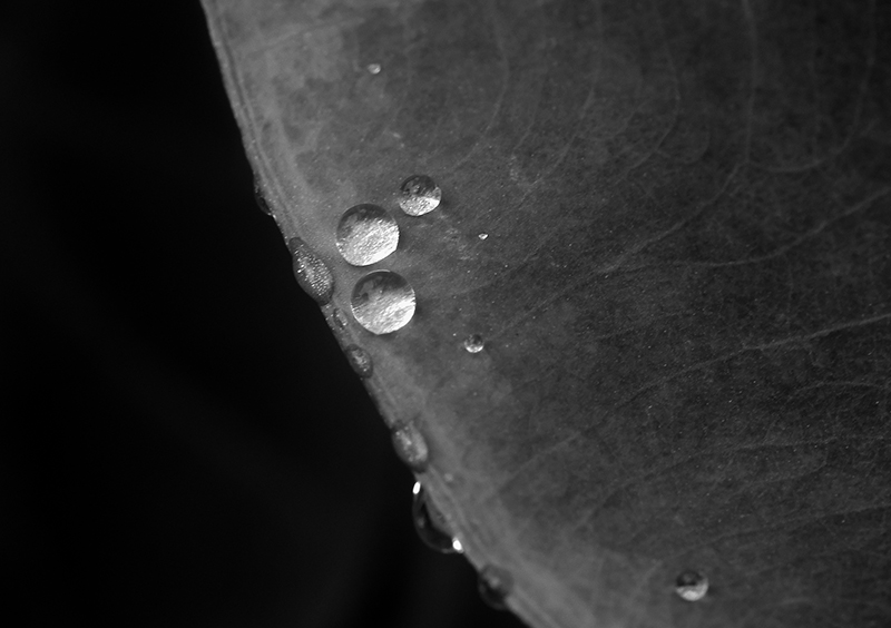
It’s a bit silvery in places, but the dullish grey of the leaf is a bit over powering. Though it’s a bit lunar-esque in its shade, so adds a spacey subtext (droplets are little satellites?) which you may or may not have been going for. A bit more deviation in tone might bring it out a bit. The water droplets are naturally the focus, but are too small in detail / too few in number to really impact overall – I also can’t decide if the very narrow depth of field is of benefit or not. I’m erring yes, but really being a bit closer in would have been more effective.
My First Weighted Scoring System ™; composition + technical 1/3, challenge* 1/1, post processing results 1/2, ooooh factor 1/3, originality 0.25/1 = 4.25 – rounded to 4 (* I don’t think it’s possible to not meet the challenge on this one) |





 Add photograph to your favorites
 Add photographer to your favorites


 Photographer found comment helpful.