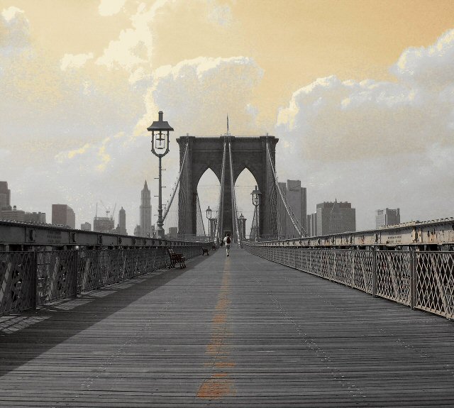
The whole week of this challenge the weather was hazy and humid, resulting in a lack of color depth. I wanted to portray a feeling of this soul vanishing into the ominous "oz" of this "make or break you" city. As CCASEY and ALANSFREED suggested I tried converting to B/W, but still had to increase the contrast which distorted the close cable/grids in compression. PARROTHEAD and NICO BLU wondered how it could be basic editing...if I could have used advanced editing I definatly would have selected the sky to increase color depth without making the bridge an unnatural blue/grey color. Since I couldnt intesify the blue, I desaturated it out of the whole image, increased the saturation then converted to sepia. Gave me the ominous sky, but maybe too much so. HEIDA's comment really summed it up. GRAPHICFUNK wins the prize for pointing out my typo title MANHATTAN! Noticed it the morning after..too late. Anyway, thanks to everyone who voted and commented!!!
A classic example of the vanishing point using one of Americas icons. Not sure I like the selective desat choice. And the streetlight throws the symmetry off. i'd move closer or farther from the pamp or use a different DOF selection to compress the lights a bit. Nice job. 6
This is a good picture though I think its a little flat like it could use more contrast or something, and then the yellow sky fixes some of that But I am not sure about the yellow sky Its very unreal and then again it adds some glow to the picture, Good luck 7
This image has a LOT going for it! Perfect composition - the cables seems to extend the vp right up to the top of the bridge. The dead centering is not normally best - but you picked the right time to ignore the rule. You handled the colors exceptionally well - the hint of color in the wood on the path really balance the great sky. Way to go!
I personally don't care for photos that are processed to the point that they look like paintings and not photographs. I love everything else about this though. Beautiful!
I love the acrid sky, but some will find it too photoshopped. To suit the mood of the sky, I might have tried the person sitting in that first or second bench with his head in his hands. At any rate, I would have taken him off the centre line. The faded centreline itself is great.
i really like the compostion of the setting but I would have prefered to see it in its natural state or jus b & w, I feel I can see what the colour enhancement is trying to do, but I think maybe in just sepia even would have been better, sorry just rambling! I'm just a hobby photographer!
great pictures ... I can appreciate the effect you've tried to make here ... but it doesn make the clouds look a bit weird .. still an awesome shot tho (makes the photo look like it was taken a long time ago) 8
This would have looked better without the orange sky and effect you applied to the whole photo, it looks like a painting here...I'm imagining it without all that stuff, and it looks great.






 Add photograph to your favorites
 Add photographer to your favorites

 Photographer found comment helpful.


