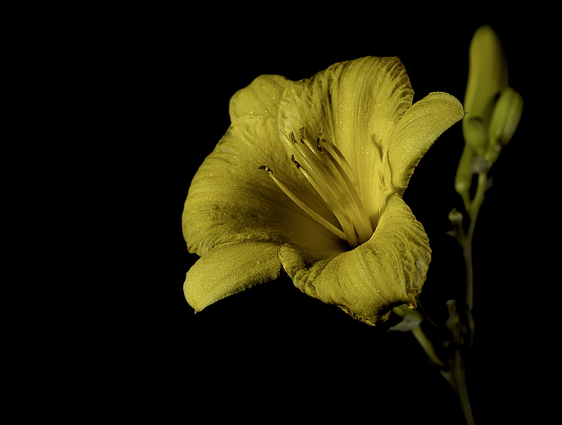
This is not my style of photography. I prefer to have interesting backgrounds that add to the composition. But this type of challenge doesn't lend itself well to that, so black it is. Looking into Low Key photography, it seems that high contrast is key. Colors are ok, and even allowed to pop, but play a relatively secondary role to shapes and contrast.
This flower was cut form my garden and brought into my "studio" (also known as a corner of the basement. To like it I used a low power light from the right with a homemade foam snoot. I also used a low power light with a makeshift snoot from the lower left.
Post Processing:
* Crop
* Horizontal Flip
* White Balance
* Increase exposure
* Increase black point
* Increase brightness
* Increase contrast
* Levels
* Reduce blue saturation
* Yellow color monochrome at 70%
* Sepia tone at 17%
* Topaz DeNoise
* Export as TIFF
* Resize
* Sharpen Edges
* Save as JPEG
Statistics
Place: 52 out of 88 Avg (all users): 5.3407 Avg (commenters): 5.5000 Avg (participants): 5.0000 Avg (non-participants): 5.4894 Views since voting: 475 Views during voting: 250 Votes: 135 Comments: 2 Favorites: 0
Lovely DOF and detail. Not sure I would have left the flower yellow .. it's such a bright and cheery color, and doesn't really "feel" low key to me when I can see so much of it.






 Add photograph to your favorites
 Add photographer to your favorites


 Photographer found comment helpful.
