Critique Club
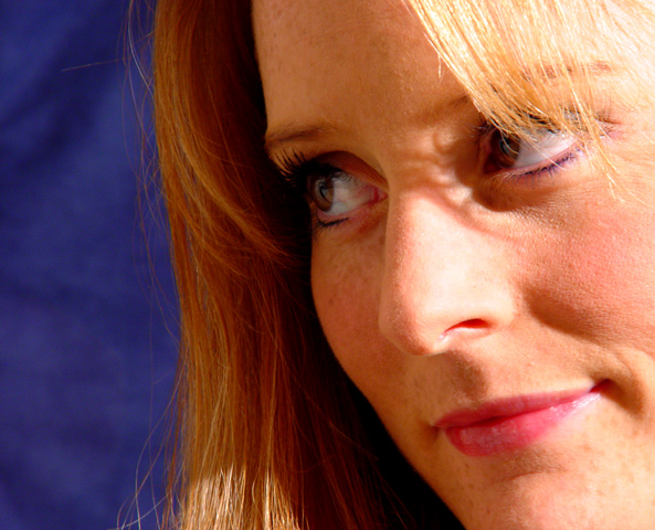
Composition Good! I like the way you have cropped this!
Background - The colur and the background is good it complements but does not distract.
Camera work Focus is spot on but your lighting is too harsh it has blown out the hair in the top right and made rather harsh pathches of light and shadow on her face.
My Opinion
A very good first attempt at potraiture!
Too tight of a crop for my tastes. Great job with the DOF. Most of the face is very well focused. I think she should be looking down and to the viewers left though. I'm not sure if that's right, but when I look at her, that's what comes to mind mostly due to the framing - Inspzil
Nice portrait. I like the shadows on the bridge of her nose, especially. I get a feeling of this woman's personality, rather than just being presented with a pretty face to look at.
Whoever took the photo of the girl looking up, lit from below (I forget the title right now), should have a look at what you did here with negative space. You've left some empty space in the area of the photo that her eyes lead the viewer towards. This is a good technique, because it makes me wonder what she's looking at. That goes a long way to creating that feeling of personality and a level of intimacy with the subject of the photo that a tighter crop wouldn't have given me.
Very nice portrait. Two tiny issues - glare off the nose and maybe a touch too close (pores a tad tooo visible). Great color/focus/interesting framing. 8 Swash
I like the composition of this picture in that by eliminating much of her head, the viewer is forced to focus on her face. Also the background color sets up a nice contrast. To me, there is a bit too much light on the face, especially the right side. If it is sunlight, maybe a thin or sheer material over the window would help diffuse it. If it is artificial, bouncing it off of a reflector (or wall or ceiling) might be nice. This is also an example I think would work well with a soft focus or gaussian blur, BUT I can understand why someone would do that because they don't traditionally score well on dpc.
The composition is just great. Coours and focus too. But I think the contrast is too hard. The hair and nose have become burnt out. Overall a nice work.
Nice colors on this. The lighting on the nose is too bad - looks a bit harsh. I like the shadows around the eye from the hair and how the details are shown so well. = 7
The shadows around her eyes, in combination with the hot lighting on her nose is kind of distracting. The background is good, and the angle and framing/cropping are ok as well. The focus around her mouth and chin seems to be a bit off, but that also could just be a product of the bright lighting. It's a nice portrait, and well thought out, but needs a bit of a lighting adjustment. Good luck in the challenge.
Composition of this shot is very good, detracted only by the lighting, which is a bit too bright, especially on the nose and the hair in the upper-right corner. Other than that, it's a great portrait shot.
Nice face. Reminds me of my high school girlfriend who was just as beautiful as your model. I appreciate the smile and the eyes. Good image, good luck. 8
Good lighting, and focus; I commend you with not going crazy with a shot DOF. The colour of the background is a bit distracting to me. Overall, a good job, congrats!
nice background to compliment the facial tones. good lighting. would like to see a little more of her chin, might be cropped a little too much but overall a very nice picture.
She is a beauty. I'm sorry the light is so harsh. It's takes away from what would of been a very _good_ portrait. It is good, just the light is too harsh. I like the colors, the girl is wonderful and the compostion is very nice.
The lighting from the right is really really harsh and casts a shadow on her nose. Except for that, this is a very well-taken image. Great framing and detail and a lovely subject to boot!







 Add photograph to your favorites
 Add photographer to your favorites

 Photographer found comment helpful.


