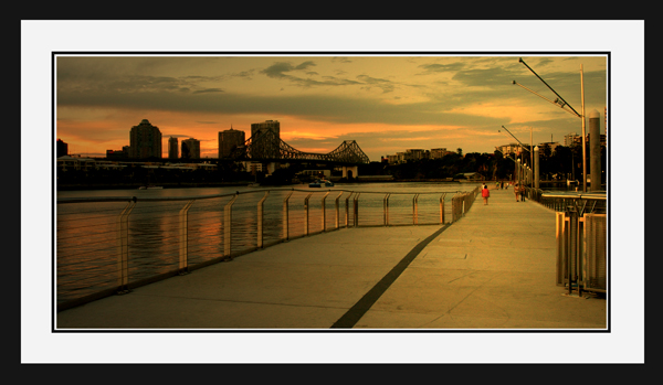
That's in impressive border. It takes up what, about 35-40% of your image? Why? Were you not confident in the quality of the shot? I wanna see more... More detail, more skyline to the right, not more border...
TC
The frame is a little too striking. It distracts. Should be darker/ more neutral, or picture should be brighter; perhaps level adjustment? Otherwise a good picture.
this photo is picture perfect. unfortunately, the vanishing point isnt very present. if it were an open challlenge, this would definately place number 1, but since there is a specific topic, i cant give you the 10 you deserve.
this is a great picture, love the colours and the theme is there...i would have presented it without the frame...to me it takes away from the overall effect
This looks an absolutely beautiful image ..the lighting and composition are superb..I just wish it had been bigger so that it could be seen in more detail.
Great work nonetheless
The border looks like a picture frame. Unfortunately, it's not a good frame for this image. I think it would have been better to leave the "frame" off and post a larger image.
slightly on the small side and the frame isnt necessary imo. since the image is so beautiful and the colors so rich and vibrant im still giving you a 10
I really like this shot, but the hugely thick border takes away from it and makes the actual image i get to see much smaller. although i do like pictures with a white matte in a black frame. =]
There is a bit much border on this for my liking. This looses a lot of impact having the photo so small.. The caption works really well though, and pulls me in to look at the person in red. Great light as well... Well caught.
Your image is absolutely superb. It has a very painterly feel, great soft colors. Composition is super well done as well. The lady in the red coat is perfectly placed (I think center is just fine, since the horizon of the sky is at your 1/3 point.) It is hard to believe that the artist who created this image also mounted it in the terribly overbearing frame/border.
Lovely photo--the colors are gorgeous. Unfortunately, I think, your frame is too dominant and takes up valuable pixel real estate that could be used by the picture itself.
I really hate doing this but I have to mark an otherwise excellent shot down a little for the ugly border.
Per pixel, it must take up more room that the photograph which is way to big. As a frame it woudl work hangin on your wall - but as a picture to critique you need to see more photo and less photoshop.
This is a beautiful photo, and yes, I believe it fits the challenge very nicely. However, I think most people are going to decimate you for two reasons: 1)It isn't an obvious, smack you in the face 'vanishing point' 2)the border is a bit strong. I believe in nice wide borders, and the so on, but yours just has a bit too much going on, I think if you cut the outside black it would be very nice. Also, your photo has a lot of detail in it that isn't visible because you chose to upload such a small image, another reason people will choose to makr you down. As for me, all that stuff is secondary to the fact that this is an excellent image, that makes a logical use of vanishing point in a strong image. 10
Man! Why the border?! This image looks phenomenal but it's too small to even see it. Make the photo as large as you can and just use a small border. This would be a great way to frame a real print though. :) I'm still gonna give you a 10.
What beauty. Next time, size larger so you don't get struck down in voting here. It won't affect my score, but I think you may see an effect from others perhaps.





 Add photograph to your favorites
 Add photographer to your favorites


 Photographer found comment helpful.


