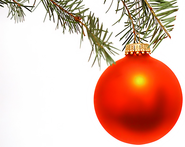
Composition : Brilliant use of negative space! The placement of the ornament as well as the branches is masterful!
Exposure/Lighting : I agree with those that liked the "hot spot". I think it added a lot to the image. Great exposure on all aspects. I was especially impressed with the detail in the golden cap of the ornament.
Focus : The softness of the one branch was effective, but I think what distracted some folks was that most of the branches were sharp and just that one part of the branch was outside the DoF. But I have to say, that didn't bother me in the least.
Post Processing : Whatever you did to it in Photoshop, you did extremely well! Seemed a little over-sharp in places (but that's just me)
Emotion/Challenge : Like so many said, print it and mail it out :) Excellent shot!
Thanks everyone for your comments. Now to explain a little on how I got the effect for the ball and the white background: I used the Levels tool in Photoshop to get that pure white background. I have to use this tool, because I don't have proper lighting. I used normal light bulbs for this picture, so those caused the background to have a horrible dirty yellow color, and it also turned my xmas red ball into an orange ball. What I did like is that after I used the Levels tool to get the white color, the ball seemed a little bit two dimensional, so the picture now looked like a xmas card. After that, I only had to crop the picture and applied some sharpening. Thanks for you compliments and also the tips for how to improve my picture, specially about the out of focus branch.
This one makes me want to turn it over to look for the Hallmark mark. I think they would have managed to get the tree in focus also, and that is all I can find.
This is a lovely shot. I really like the white background and I am very fond of the color of the ornament. You left in just enough of the tree so as not to be distracting. The focus seems soft on the top of the ornament.
The color of that ball is pretty funky and the "sun spot" is a little distracting. I really like the composition and placement of the ornament in the frame though. 6
This definitely has that "wow" factor everyone talks about :). The red ball against the pure white background is perfect. I love the yellow hot spot on it. I'm sure a lot of people will say the needles of the pine tree should all be in focus, but I love the DOF you've used! The overall effect has a subtle resemblance to a watercolour painting. It would be great on a Christmas card (I'm sure a lot of other people are saying that too!)
Powerful image, lots and lots of negative space. The glare spot on the ornament doesn't seem too nasty. How did you wipe out the background so completely? Nothing to do with your photo, but the branch to the right of the ornament seems cut off (at the tip and some of the needles). 8 Swash
WOW. If this were in a magazine, absolutely no question would I think the ball was airbrushed. The effect you've acheived here is really amazing -- two (maybe even three) completely different and yet all incredible textures that would work well on their own... but work even better together. I love the white space.
This is a very nice photograph. The one small thing that disturbs me is the tiny bit of pine that is not in focus. Everything else is so crisp and clear, that bit seems out of place. Wonderful colors.
The softness of the ball, combined with the mix of focus on the middle branch, makes my eyes water trying to focus properly - there doesn't appear to be a clear focal point to the image either. However, the colours and background contrast really make the ball jump out.
Great use of freespace, and color. Good choice with the all white plain background. Great composition. The only thing that bothers me is having only one branch out of focus but all the others in focus. I maybe would have cut off that piece for a cleaner looking photo. Nice job though!
A very "Hallmark" image (it's a complement). I like the gradation of the red on the ball, however the reflection (the yellow spot) spoils it a bit for me. Great composition, good effort.
This is an excellent shot :) I love the composition here... the only minor issue that catches my eye here is the pine twig that is out of focus in near the ball.. maybe a little more depth of field would fix that up. Since the marjority of this image is in focus, I believe it would work better with all of it nice and sharp... good work :) - setzler
The tones of red and orange in the ornament are amazing. Overall, I feel all of the white area is a little stark. A little more greenery may help (IMO). The loss of DOF in the greenery overlapping the ball is a little distracting. I think you have a great concept here, and your lighting of the ornament is perfect. I'd try a few more shots with different greenery.
What great focus and clarity. I really like the placement of the bulb within the photo. The branch is a great touch. Your DOF is good in my opinion. Color is wonderful! This could be on a christmas card for sure. great use of negative space as well. Good luck in the challenge.
I love this because of the white background, but you probably know I do because of my blue submission. I love your choice of the red bulb and the green pine tree. This is a big fat 10 in my eyes. I would love to have this as a christmas card. The lighting is great. I like how the lighting turned the bulb yellowy orange. Perfect framing. Lovely shot!
Outsanding. The only thing I could complain about is that one piece of that one branch that isn't in focus. The bulb looks amazing against the white though, and the white is really white, I like that a lot. The branch on the top right side looks cut (which I'm sure it is) but it would have looked better if it was more natural looking. Overall amazing excellent shot.
It's so round and stark that it looks fake! In this instance, I would like to have seen the needles in the foreground be more in focus and the others in the background more washed out. The big blur right in the center of the photograph is the first thing one sees, and it's sort of distracting. I love the color and plain background...
This is odd in that it almost looks like a silk-screen somehow. The ball looks sort of unreal. Is it because the plane of focus is at the edge of the sphere, and the front of the ball is actually out of focus? Quite nice though, lovely composition, simple and clean, though I'd prefer a little bit more white space.
Looks like a christmas card. Nice composition and great job producing an evenly lit background. I would prefer the ball were a bit redder (instead of orangey) and wish that branch wasn't sticking into the foreground messing up your otherwise perfect dof. Great job! 8






 Add photograph to your favorites
 Add photographer to your favorites

 Photographer found comment helpful.


