I voted first, and now I going through to see if I can find the originals to see how I voted on the first shot.
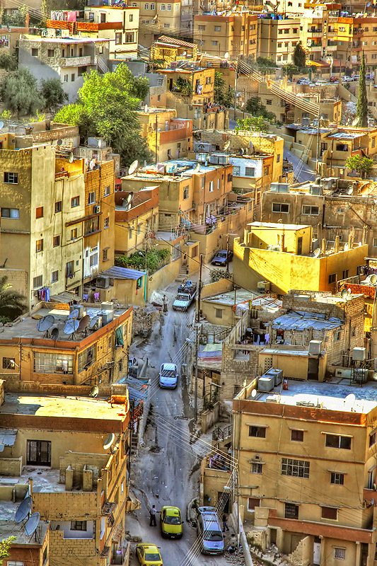
Drat! I didn't vote on the original. I gave this one an 8 -- I like the processing much better than the original. It's more of a painting feel -- looks like something that should print quite large and hanging in a lobby somewhere.
Love the business and the hectic stuff going on... The predominant sunny bright yellow is nice and evoke life. I'd jsut try to add just a bit of black to increase contrast. Overall, very effective and interesting image!
A photographer I admire and an image I remember without having to look it up. I like the new crop on this shot and the warmer colors. The leading line from the zig-zagging wires really takes you through the street to the end. In your last shot, the scene felt somewhat cut off due to the square crop. One thing I miss about this shot from the other one is the details. Being so close up in the other shot brought me more into the scene. That is a matter of the site image size restriction though. Surely this is a bigger image and if you had the same width as before, this shot would be just as spectacular. Overall a nice improvement I would just like to see it bigger, but that does not affect my vote.





 Add photograph to your favorites
 Add photographer to your favorites


 Photographer found comment helpful.


