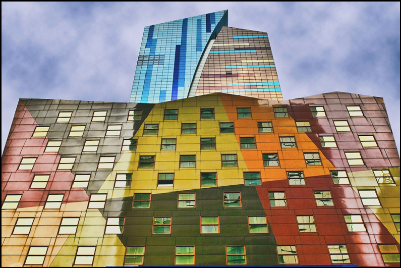
The over-saturated original I hope the general public finds something better about this newer version of this venue.
[Jun. 30th, 2011 07:47:28 PM]
"NY at it's worst" !!!! Love that comment... watched this building go up over the course of about a year or more. It's ugly, yes, but at the same time it's colorful enough (and different enough) to fit in with the plethora of Times Square.
no 1s, 2s or 3s - well that's a triumph, thanks!
Statistics
Place: 23 out of 74 Avg (all users): 6.3952 Avg (commenters): 7.5714 Avg (participants): 6.3415 Avg (non-participants): 6.4217 Views since voting: 2603 Views during voting: 243 Votes: 124 Comments: 9 Favorites: 0
I almost looks like a painting on the wall, not a real building. I would have used more saturation and contrast to give more life this otherwise colorful image, and avoid the border...
That's a supremely cool building. Those exact lines and angles of the structure really contradict the painting style, which is what makes this so interesting to me.







 Add photograph to your favorites
 Add photographer to your favorites


 Photographer found comment helpful.


