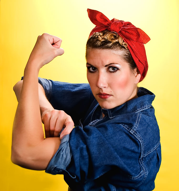
The original I did always bugged me. I knew the focus was off but at the time I didn't have any lighting and it was ridiculous trying to get a good pose of myself and not throw shadows on my face from my hand. Finally I just gave up and entered the best one I had. This time was much easier, plus we had advanced editing rules. I don't think I will do spectacular with this shot but I should improve my score. Here is the last try:
Statistics
Place: 5 out of 74 Avg (all users): 6.9426 Avg (commenters): 8.4000 Avg (participants): 6.8947 Avg (non-participants): 6.9643 Views since voting: 6810 Views during voting: 309 Votes: 122 Comments: 26 Favorites: 3 (view)
What an amazing job you did matching the colors of the original - and the hair style really brought it home. Beautifully photographed - I voted earlier and gave you a 9
I remember your original entry. You definitely improved upon the focus issue. The smooth skin, better, lighting, and better details all help too. Nice improvement.
Voted this as one of my top 3 favorites of the challenge then found the original. You got an excellent score last go around but you have really polished this one up nicely. I expect to see it finish quite high. Good luck.
Definite improvement over your first photo. The lighting is much better. I noticed how you got some shadow on the front of your forearm, like in the poster which suggests you used good side lighting from camera right. The sharpness is uber on this take! I like your take on this subject and I can't offer any improvements. I can offer alternatives because there are always a thousand ways you can do one thing. Some alternatives to try in your processing might be to add some noise or a bit of soft focus to the image. When I look at the poster images, the use of the printing technique seemed to give some speckling to the poster, which is why I suggested noise. Also in the poster, Rosie still gave off that feminine mystique so I think maybe some soft focus might aid in that in your shot. Also I thought it might make it more true to the era rather than the HD shot you have here. Just suggestions though, not real critiques.







 Add photograph to your favorites
 Add photographer to your favorites


 Photographer found comment helpful.


