|
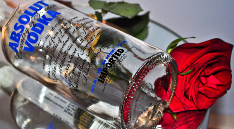
This image feels off for me. The word 'imported' is not only the most legible word on the screen, but it's also the center of your piece. The lighting seems to only capture 2/3 of the rose- almost giving the appearance of a vignette that exists only on the right side of the image balanced by what looks like a hand? on the upper left. All of that to say, I would recommend a cleaner image in hopes of a clear concept to be given to the audience. |





 Add photograph to your favorites
 Add photographer to your favorites

 Photographer found comment helpful.


