This was one of the most fun challenges yet, and stretched my creative juices to the max. I'm not a drinker, but I do love the classic Absolut bottle shape. Coming up with a "new" ad idea was the hardest part.
I am totally humbled. This is a new PB for me, first score over 7, and my very first ribbon on DPC.
Wings were printed onto transparency film, cut out, and affixed to the bottles. Everything was placed on transluscent plastic and lit from the bottom and from behind using daylight balanced compact CFLs. The flying bottle was suspended by a very fine fishing monofilament. Post processing in Capture NX2 included tinting (gold) and blurring of the background, with selective exclusion of the bottles and wings. A little more blending minimized the remaining monofilament visibility. Then a few adjustments to even out the highlights and shadows a little to soften the look even more. THAT'S IT!!! ;-)
Statistics
Place: 2 out of 63 Avg (all users): 7.4928 Avg (commenters): 8.7273 Avg (participants): 7.3333 Avg (non-participants): 7.5366 Views since voting: 9142 Views during voting: 485 Votes: 209 Comments: 39 Favorites: 9 (view)
Fantastic idea and execution. The pale gold tones and the soft focus effect work amazingly well. Congratulations on your absolutely deserved ribbon :-)
I love Williams blue ribbon winner but I absolutely ;-) ADORE your image. It's so beautiful... excellent work. It's going right into my favourites.
Many congrats on your first ribbon and new PB, Mark.
I love the softness of this, as well as the placement of the bottles. This is so well executed. The bottles really appear to be floating in space. The idea is wonderful, execution wonderful. Very nice job.
This was expertly executed. The post-process really adds to the softness of the idea. The curves of the bottle are accentuated and further softened. I also love the dynamic the hard edges of the wings added to the image. The image would have been a bit boring if the feathers were soft. Great coupling of yellow and blue also. My only complaint would be that there's a bit too much negative space on the bottom and left of the image. The centerpiece is in a bit of an awkward place. Perhaps a tighter crop would help.
Looks like a Mothers Against Drunk Driving ad- all you need is a set of car keys in the shot- well done- well executed- in fact- perfection! another good title might be "absolution"





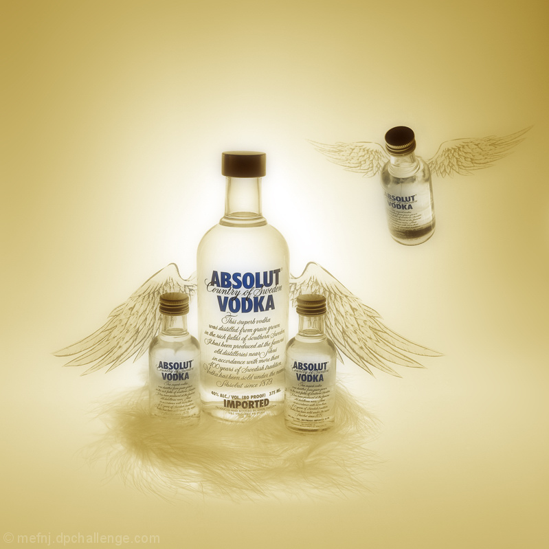
 Absolut Heavenly
 Add photograph to your favorites
 Add photographer to your favorites


 Photographer found comment helpful.


