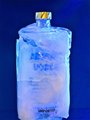
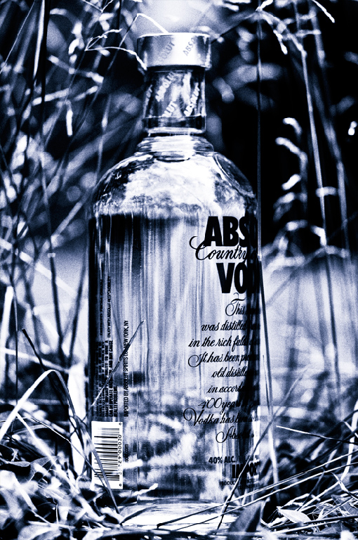
Somewhat surprising to see the grain in a challenge like this, but it's appreciated. Your entry is different in other ways too- the blue, the fact that the bottle is askew.. interesting. I like it.
This is probably my favorite in this challenge. It's diferent. I am not entirely sure I understand the title, but I like the creative take on the 'ad'. The strong contrast and blue hue really works to your advantage.





 Add photograph to your favorites
 Add photographer to your favorites

 Photographer found comment helpful.


