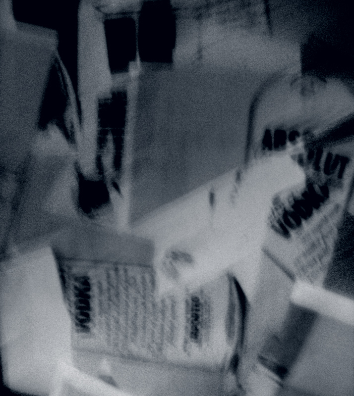
I... uhh... I... uhhh... I've got... uhhh... nothin' here. I see some vague Vodka words... but I'm thinking that Absolut® would not use an ad where their logo was not prominent.
But... perhaps I'm wrong.
Wouldn't be the first time.
I may or may not be voting, so please do not equate my comment with any score.
I really enjoy the abstract effect of the image. It gives it such a fractured feel. To me, it feels like Absolut Vodka in the city. The upper half of the image looks like the tops of buildings; you can almost see windows. The bottle of vodka is standing strong in the city landscape. The connection between the horizontal bottle and the vertical bottle is perfect: my eyes are bouncing back and forth between them. Your use of lines is perfect.






 Add photograph to your favorites
 Add photographer to your favorites

 Photographer found comment helpful.


