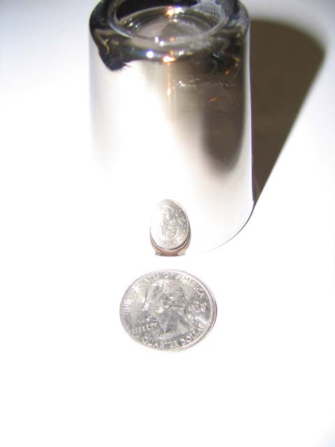
Intersesting image. I think you could have gone even further with the idea to make it a bit more solid. I would suggest that the cropping could have more space at the top to have some blank space above the glass. Also a simple border would just top it of as something that could hang on a wall in a modern cafe. I would also sharpen it a little as the focus is a bit soft. The lighting could also have been diffused as it is a bit harsh and bright. Also you could consider the things that are reflecting in the glass. I don't mean to harp on I just think this is a great idea with lots of potential and that its just a few technical things that stand out to me. Good luck.
The challenge is to make the impression that the "subject of your photo is a tinier version of something that is normally larger." It doesn't meet that challenge in my mind.
intereting take on miniature...it would probably come off better with sharper focus and less harsh lighting. nice angle; too bad the top of the glass was cropped out.





 Add photograph to your favorites
 Add photographer to your favorites


 Photographer found comment helpful.


