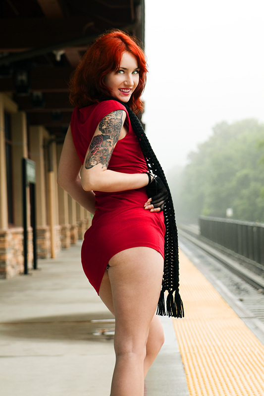
This was a quick edit on a shoot with a model named Prentice. The red on red was just fantastic. I feel like I didn't do it much justice, but will re-edit it when i get to it and try to make it all stick out even more...as I saw it when I took the photo.
Statistics
Place: 101 out of 127 Avg (all users): 5.3252 Avg (commenters): 6.2500 Avg (participants): 4.9800 Avg (non-participants): 5.5616 Views since voting: 1608 Views during voting: 418 Votes: 123 Comments: 8 Favorites: 0
This is certainly an eye catching shot, but beyond that it doesn't really have the aesthetic appeal to keep my attention and there is nothing to say 'hey - February!' apart from the title. Hmmm. What to say?
Technical: There's nothing really wrong here. I'm assuming that you wanted the station to be identifiable or you would have opened up that aperture, but it isn't really an appealing background, if I'm honest - neither cutesey or gritty, just there.
Artistic: I think, on reflection, that it is the background where this shot falls down. The settings, perspective etc are all bang on for your model, but the way the background is displayed doesn't really add. You don't show much of it, the perspective of it doesn't show it to best advantage and the 'bits' (platform, sign, doors) don't tie together because of the very central, very large, positioning of the model in the frame.
I hope at least some of that makes sense, noting that it is always easier to critique than to shoot!
Something strikes me as wrong about this shot- I mean, I like women, and scantily clad asses as much as the next dude does, but its all in your face like "here's ass and my huge tattoo." But, good pose and look on the model.







 Add photograph to your favorites
 Add photographer to your favorites

 Photographer found comment helpful.


