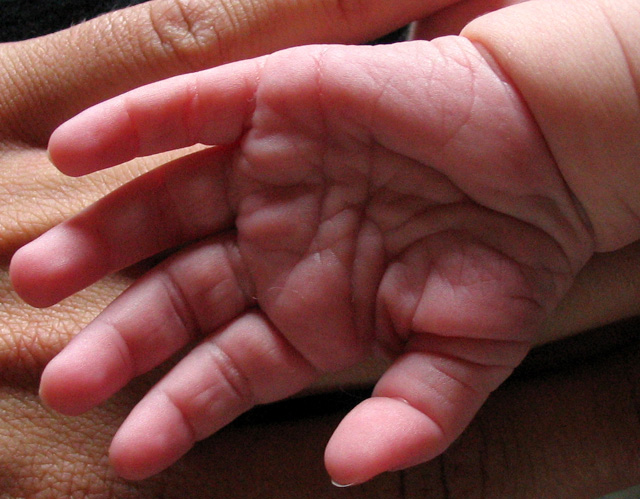
Nice lighting here, I like the grainy effect, I think this would have scored an extrat point from me if it had been in B&W.
While I can definately see that it's a smaller hand, I think it might have been better if you had moved back a bit with your camera. The wee ones hand looks quite big, I do know it's against the adults one, but the perspective looks a little wrong. 8
This one seems very miniature. But less croping or wider frame would have given a better comparison. Also I think it would have been better to turn the palm down to show more of the smooth skin at the back of the hand of a newborn. For this subject sharpness is not the most vital thing (for my opinion) so I think litle gaussian blurr would have make this one better expecally since it seems litle noise.
But the idea is fine and the image is ok.
Just because it is the way I normally present hand shots, I would really like to see this image in black and white. The lines and details just really seem to jump out at you when in black and white. I like the composition and the light, but I would like to see the little hand more in focus and the large hand a little softer. Just my opinion though. Good work.
might be just me ,but the color of the baby's hand looks a little strange... maybe from compression? Also, the baby's palm is a little dark. Otherwise, nice focus and a good idea... 6







 Add photograph to your favorites
 Add photographer to your favorites


 Photographer found comment helpful.


