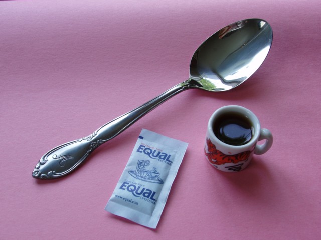
Very nice interpretation of the challenge! The focus, composition and colors are all good. To me, the pink background stands out too much - you can really see the texture of it. Also I think the lighting would be better if if was coming from a different angle. The little coffee mug is so cute but it is really obscured because the shadow is falling in front of it - it the light was coming from the opposite direction so the shadow was falling behind the cup, I think, it would have added to the picture.
Your corner is showing. So to speak.. The edge of your backdrop / sheet of card is showing in the top left. Also the 'hump' in the backdrop near the top is distracting.
If you curved it deliberately, you really need to keep it curving upwards out of the picture, as the dark-light-dark transition catches the eye...
i think that a simple white background would communicated the miniature a bit better. i find the pink/purple background takes away from the image somewhat. nice idea.






 Add photograph to your favorites
 Add photographer to your favorites


 Photographer found comment helpful.


