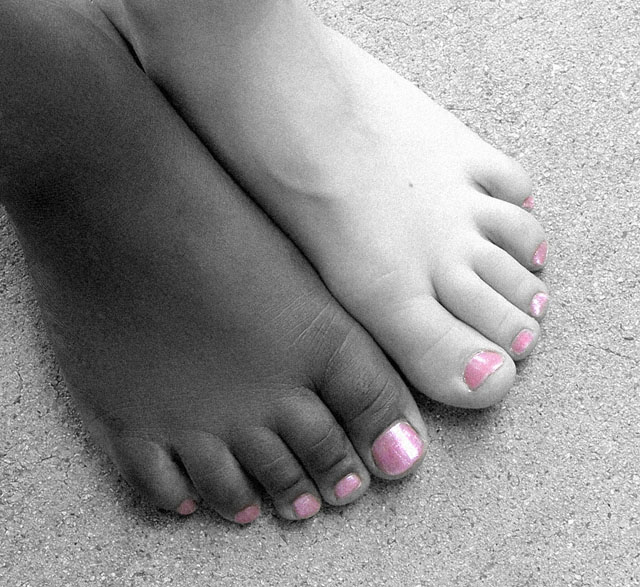
Good composition, nice idea, good grainy feel to it. Creating a link through the toenail varnish is a nice touch (better than the other attempts here).
I like the grainy apperance and the color desaturation, but think the color could have been more saturated. Your lighting appears too harsh and uneven and directional and had you used softer light it would improved the color in the nail polish and would have yielded more detail. Still, I like the composition and toning.
I can't vote in this challenge, but I would give it a 10. I like the pink toenails, they give it just a little pop, not too much. Only possible complaint would be the nail on the big white toe. Looks like it wasn't clipped straight, but it still adds a bit a character.
This is a very nice study illustrating brotherly love. The twist to use the color nail polish on both advances and raises the value if this image. Bumping from 5 to 7
I don't usually like selective desaturation because so many of the examples seem to use it for the sake of using it rather than because it's use really adds something to the shot that wouldn't be achieved with all colour or all black and white. In your shot I really like it's use because, to me, the colour really highlights the message that skin colour isn't important and that people of different races often have more in common than they have not in common. Nicely composed too, simple and unusual. Texture and pattern of floor surface complements rather than distracts. 8
excellent shot. a little grainy, could probably use a little more contrast, but not enough to take points away. like how the polish ties the feet together.







 Add photograph to your favorites
 Add photographer to your favorites


 Photographer found comment helpful.


