i can see you are new, most of my first shots were this small. you'll have
to figure out how to make them bigger to get higher votes. anyhow i like
this
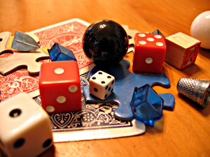
I like the random balance that you've created. The depth of field works well too. The focus seems a little soft. I think a border would help to "contain" the subject matter. You've made a bunch of quite different objects into quite an interesting picture.
Just gonna say one thing.... way too small. Take full advantage of the size limit. Small images don't do well here. If you want tips on resizing to fit within the rules, drop me a private message. :-) 6
I think you might have been going for a collage type look or a scattered subject. I don't think you got either effect and just fail to see any other appealing design in this composition. The lighting seems to have a color cast and its fairly directional light but I don't see how the shadows add to the composition. It looks like the image has a relatively narrow DoF. The blue plastic house to the left of the black object (marble?) and the red die to the right of the black object seem to be in the field of focus while the farthest corner of the red car and the other blue plastic house, thimble and large white die seem to be blurred. A narrow DoF can be a useful way to direct the viewer's eye to what you as the photographer want to show as the main element but in this composition it appears to be the black object which is difficult to see any texture or definition in and is also uninterestingly centered. I think you have a good idea and you chose a style of photograph that can appeal to many viewers since it lends itself to having multiple objects, any of which might be familiar to a viewer. I think you could make this a more compelling shot by replacing the black sphere with the thimble or some other piece of miniature memorabilia, recomposing the shot so that its not so statically centered but so that it draws the viewer's eye off center a little and invites him/her to wander around the image and then put a few more items into the composition so that the wood grain of the underlying surface doesn't show as much. Good idea and good attempt.





 Add photograph to your favorites
 Add photographer to your favorites


 Photographer found comment helpful.


