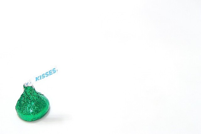
Composition: Excellent. Use of Negative Space works in that the "kisses" tag leads my eye into the white space, and the white space pushes my eye back to the green wrapping.
Technical: I like the use of lighting... no harsh shadows, although I do wish I could better see the outline of the tag.. Sometimes wishes cannot come true - I realize this - but with the background so white, I wonder if any other lighting position would boost the less white outline of the tag. (does this make sense?). I even wonder if you could have 'cheated' by lighting touching the edge of the tag all the way around with a green or light blue marker. (Okay. I'll let it go.. now I sound obsessed).
The use of the slight shadow grounds the subject - so that it doesn't look like it is floating.
Overall good. Limited in keeping my interest, but cute.
This is cute, but daaaaaaaaaang if that isn't a whole lotta white! It feels sort of like the kiss is just pushed down in the corner. I think you basically already got a lot of good feedback. I don't agree that it needs more saturation. I think the lighting is a little too harsh for that reflective foil though. Did you try diffusing it? It also bugs me that the white tag blends into the background.
I was wondering if you couldn't do some sort of photo using more than one kiss that would really USE the negative space. Perhaps with a cute title. Sort of like a greeting card, with two kisses that want to kiss but there's a lot of space between them? I dunno ...
This is a cute idea. I like the placement of the kiss. I also like that the label clearly reads "Kisses". You have a perfectly white background, which makes it stand out. I would have bumped the saturation up a touch to make the green really pop!
A bold experiment, but the object just isn't interesting enough, thematically or aesthetically, to make any use of all that space. The fact that the white of the "KISSES" tag blends with the background makes it confusing as well.
And Merry Kissmas to you, too. The white IS just a little loud here, as far as the brightness. Maybe a little darker gray would have helped, but you know how that is.
Is it possible the background here is too white? It actually hurts me eyes to look at it a long time lol. I think this is a nice shot - the detail on the foil is very good. Cute idea = 7
Interesting idea, and good use of negative space. The white background, presumably brightened using levels, unfortunately makes the label merge into it (intentional?), making the label seem separate from the main subject, which in my opinion detracts from the overall image.
A great idea, excelent use of negative space. Color is good. My only nitpick is that the lighting seems to be washing out the white tag. The edges aren't very distinct at all. I think that the lighting on the foil is good though, but just too bright for the white tag. Love the placement within the photo. bottom left is a great choice for this, with the tag leading toward the center of the shot. Your focus and clarity are really nice as well. Good luck in the challenge.
I love the white background and it seems to be popular. It sure makes the subject stand out. Very clear and nice focus. Great use of negative space. And green is one of my favorite color. :)
Absolutely fantastic. I love this. Getting those stark white backgrounds is hard and this is done well. The wrapper of the Kiss doesn't blend completely into the background (like my boardwalk and parkplace cards did) Overall well done. Great picture.







 Add photograph to your favorites
 Add photographer to your favorites

 Photographer found comment helpful.


