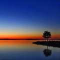
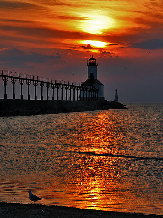
Quite the serendipitous stop along the way on our trip to Minneapolis. I knew there were two lighthouses in town, but who knew we'd get such a great sunset to go along with one?
My brother doesn't like the gull in the foreground. I do. Which one of us is right?
I gave it an 8 (probably because I love the bird -- it makes the photo), but there definitely is haloing, and usually I'll take a point off for that. The water does look oversharpened.
I love to take photos like this one with strong color and silhouettes. I like the seagull as foreground interest. The composition may have benefitted from taking the photo earlier when the sun is behind the lighthouse and perhaps peaking through the top window to get some interesting rays. The blue could be processed to clear out the muddy gray which appears a bit heavy. Overall, this scene is pretty but not polished enough in either processing or composition to achieve more impact. My two cents...;-)
Hope this helps, since you asked: over-sharpening artifacts, haloing around the pier and lighthouse, harsh light, vertical crop might not have been the best choice...
I think you relied too much on eye-popping colour. (Eye-popping isn't always good, and often looks artificial.) Consider this photo without the orange cast: a fairly straightforward shot of a not-too-interesting subject. Nothing really connects here with the average viewer to make it stand out as an exceptional photograph, and so I think the score reflects that.
I don't see the artifacts others are talking about, could be my eyes or my monitor (I often got comments about that as well). I thought it was beautiful and gave you an 8, so I can't help to explain your 5 votes.
Something else that might have got a point or two knocked off by some voters is that it seems to be oversharpened. There is a halo around the bird, the pier and the top of the lighthouse. It also undoubtedly accentuates the ripples in the water and as EL-ROI said smoother water would have worked better to add to the smoothness and calmness of the sunset. Hope that helps a bit more...
I think, like EL-ROI said, the water would be so much better smooth but obviously sometimes that's not possible. I also think the foreground and the pier are lacking some detail and could maybe use HDR. Saying that though its a photo you should be proud of.
I like this photo. You got a nice high average score for this site. 5.6889 to me means people liked it but it still needed something. I really liked the composition, the lighting is spectacular, the pigeon is an added bonus and really, the horizon seems just above center, though not quite conforming to the rule of thirds. I think the saturation is decent. Possibly a little less could have worked better. The contrast is a little heavy in my opinion.
What could have made it better? Well a longer shutter speed to smooth out the water of course. Compare this photo to your personal best photo and notice the difference...
Your PB has the same saturation but is softer due to a longer exposure. The water is like glass and shows off the reflection well. Hope my comments helped.





 Add photograph to your favorites
 Add photographer to your favorites

 Photographer found comment helpful.