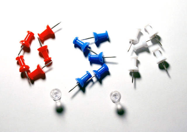
This is stretching it for me. It took me a couple of moments to figure out it was an outline of the US. Someone else will probably think it is brilliant. I don't really see an outline map as a miniature, at any rate.
"Compose and photograph something "miniature" in such a way that it conveys to the viewer that the subject of your photo is a tinier version of something that is normally larger."
The "U" is sloppy. The picture is overexposed (no contrast w/ white pins near the top). Focus needs to be tighter. Shadows are harsh. Missing the 3rd " . " pin.
I find it difficult to see that this says USA, perhaps doing it on a bigger scale would make it easier to read? Also the white drawing pins / thumbtacks don't stand out very well againts the white background.
forgive me for being dense, but i'm not sure how this meets the challenge. it appears to be more of a macro shot that could use a little sharpening. the lighting is also a little strong.





 Add photograph to your favorites
 Add photographer to your favorites


