:: Hello from the Critique Club :: ............................................................
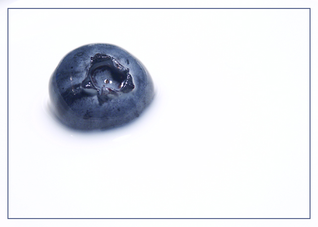
Firstly, this is a very cute concept, very striking and well designed compositionally. It's well shot, crisp and clear.
As it stands your blueberry looks more like Earth, so you could have titled it 'Cratered Earth in the Milky Way'. I did in fact see what this looked like inversed (hope you don't mind) and it did look spookily like the moon! It may have been an idea to try this and use Hue/Sat to give it the blue hue. Normally, in challenges this kind of treatment would be voted down but given the theme it may have survived in tact.
All the best for future challenges - I'm sure you'll do well.
Great composition. The very bright white is really nice. There's a little excess blue tint at the upper left corner outside the border, though that is a little distracting. The border is clean and tidy though and adds to the image's simple elegance.





 Add photograph to your favorites
 Add photographer to your favorites

 Photographer found comment helpful.


