Author Thread Comments Made During the Challenge
Post actions
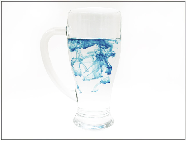
It'd be nice if the shape of the glass was defined a little more. Interesting idea.
Post actions
Maybe if the glass had a little bit more definition it would have worked better, Nice concept though. A 4 from me this time
Post actions
Very original!, portrait orientation would probably have been better. 7
Post actions
A tighter shot on the dye spreading through the water would have been more effective for me. 4.
Post actions
Oooh, really cool. I like it. The rest of the mug is a bit overexposed at some places though and it's hard to separate it from the background. Nice interesting image.
Post actions
Good concept,bad background choice
Post actions
Post actions
Post actions
Now that you did a high key set up try separating the glass from the background. it blends in too much witht the background. N because of that some people wouldnot understand the concept of the picture Good job though
Post actions
love the idea for this, personally would have preferred to see more detail of the glass too, but its a great shot! (9)
Post actions
Nice shot, possibly a bit over-whitened - think they'd notice, though.







 Add photograph to your favorites
 Add photographer to your favorites


 Photographer found comment helpful.


