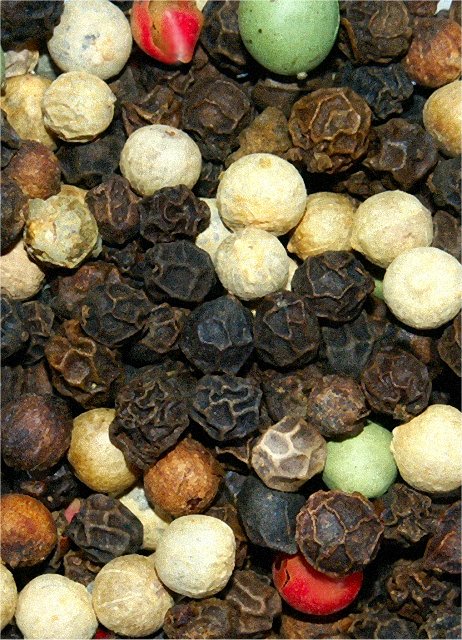
I really like the crinkly texture; reminds me a little of a photo I did of some lychees. I think the brightest highlights on the white peppercorns are just a little TOO bright (for me); I had a couple of similar spots on my own Macro entry and finally went back and just barely touched them with the burn tool, and it seemed to help.
Given the emphasis on the texture of the individual peppercorns, but the overall amorphous arrangement (unlike some previously-seen yin/yang presentations), I think there may be something vaguely disturbing about the portrait orientation. I probably would have cropped to a square, but I suspect you may have gotten a small bump in your score just by putting it on its side.
I also want to get cute and re-title it Peppercorn Salad : )
This was an interesting choice for a Macro challenge. It reveals a desire to achieve something original (oddly, I toyed with the idea of vari-colored peppercorns myself). You don't mention what you were aiming for so I'm going to evaluate this based on the assumption that you were going for a flat, graphic quality rather than a more three-dimensional study. If this is the case, you were fairly successful. There are no distracting glares or hot-spots to interfere with the pattern created by the peppercorns. There are shadows but they are compressed and black enough to work as a sort of outline throughout the design. The white peppercorns at first seem rather distracting but a longer viewing reveals an S-shape created throughout the vertical plane accented at either end by a red and green peppercorn. This may be purely accidental but it is interesting enough to be worth noting. I have to agree with other commenters that the image is a bit grainy. I'm not convinced that it hurts this image though. It might be interesting to add even more grain and see what results.
In closing, I find that although it is not an entirely successful photograph, it reveals curiousity and a desire to explore the texture, form, and color of your environment beyond the 'safe' subjects, which is a step in the right direction.
It's a noisy image and quite dull really. This needs better lighting (low ISO?) and more of a purpose perhaps. Imagine trying to sell the product to a food producer or something and it will help you make it look more appealing.
i never thought i'd see pepper in this challenge, and your's isn't the only one. the detail in the pepper is really good. good shots show you something you don't normally see.
Nice subject - some interesting textures here. I like the colors as well. I think you crop even more - from the top perhaps leaving only one red and one green - it would give something for the eyes to settle on. The image is very grainy and there are some odd processing articafts - particularly in the red peppercorn - did you pump up the saturation too much?
Very nice subject matter. It has a great deal of texture and color contrast.
Similar to my own shot, this might look better if shot at more of an angle. Instead of a 90 Degree straight into the Pepper, use a 45 or even 60 degree angle, which could add more DOF to the shot.
It could add more interest to this otherwise nice shot.
As it sits, I can see this hanging in someone's kitchen, not as a huge overwhelming piece, but maybe as a 4x6 or 2x3 image in a nice kitchen related frame.
Wonderful idea. Your image has several things going for it including: Great flat lighting, perfect exposure, nice combination of colors, and nice combination of textures. On the down side, it lacks a bit on the composition. One of the colored peppercorns - probably a green or red should have been positioned at one of the critical "crash p[oints." In addition the green and red ones on the top edge should not have been cut in half - but it is quite ok for the really dark ones. Having said that - it has more good qualities than improvement areas - so nice job!






 Add photograph to your favorites
 Add photographer to your favorites


 Photographer found comment helpful.


