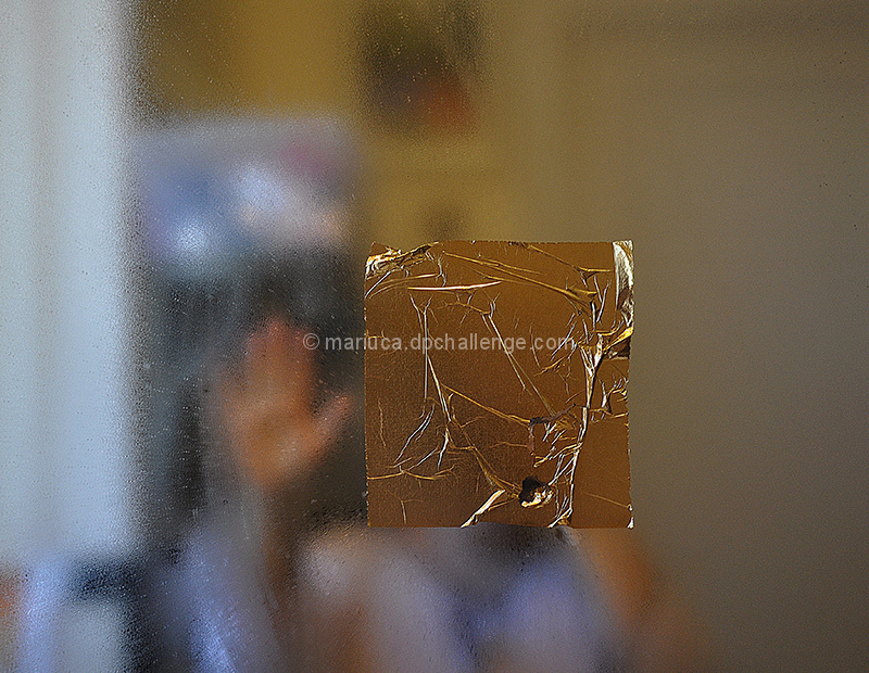
Since I love the subject, I took quite a number of pictures prior to this impulsive one taken at daybreak.
A touch of cropping from both sides and just a tiny sharpness. I was glad to do such a minimal editing. Could have used it as such also.
I am more interested in comments for this challenge than for any other.
[May. 16th, 2011 12:17:00 PM]
I think that my 3 word title affected what was supposed to be a thousand word image. At least reading the 7 comments that I got so far.
Should have chosen a title closer to the intention of the image. Perhaps:
"Leave with Golden Memories"
Statistics
Place: 85 out of 98 Avg (all users): 4.5051 Avg (commenters): 6.8333 Avg (participants): 4.1190 Avg (non-participants): 4.6104 Views since voting: 855 Views during voting: 311 Votes: 196 Comments: 12 Favorites: 0
Mariuca this is beautiful. Love the representational yet very abstract feeling. That golden foil just floats there while the hand is waving goodbye. Quite emotional.
The first thing that grabs me is that what appears to be your main subject, the tape or whatever it is, looks more brownish than gold, at least on my monitor. Some of the creases it in look quite golden to me and I would have preferred the whole thing to have that hue. If I were voting I would not deduct for the color, it's close enough.
Your idea here is fascinating and while it doesn't have mainstream DPC appeal it does have an audience. This photo really works for me because the person behind is blurred and the tape just adds another layer of obfuscation. The hand is a nice touch and contrasts nicely with the background.
IMO, it would be a stronger image if it were cropped differently, maybe a bit off the right or even in portrait orientation. Having a smaller strip over just the mouth may give it a different feel.
I see what you are going for here but I think it will be missed on most voters. Great idea but DPC (and I) enjoy eye candy. If this was a shot of a person with gold foil on the lips it would be perfect. The blurry and OOF person does nothing for this image.
Very interesting and original composition. Very cool contrast of textures. Right side - I think is not the strongest case of negative space - little bit cropped will work better.
A bold strike for the abstract, props go to you for that, but the meaning is lost (to me, of course, all art being subjective) because the foil covers much more than just the subject's mouth. 5








 Add photograph to your favorites
 Add photographer to your favorites

 Photographer found comment helpful.


