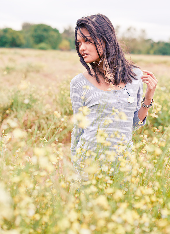
I feel like this could be in a clothing catalog... JCrew, Abercrombie, or something like that. I'm not sure if I like the tilted horizon--I'd have to see it straight to decide.
I really love the composition and the feel of this image, but for me, it lacks vibrancy. It appears kind of "washed out" and I believe that a slight adjustment in curves would have made a difference. I know that there is a post-processing style that leans towards this slightly desat, retro look, but, with a very few exceptions, I am not a fan of that. Just my opinion, of course. (Also love that the flower pendant she is wearing kind of mimics the flowers in the field...that's a nice touch.)







 Add photograph to your favorites
 Add photographer to your favorites


 Photographer found comment helpful.


