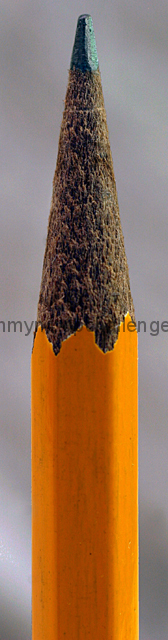
This is a great shot. I really like the way the background to this image really works with a greyish almost graphite feel. It's a nice contrast to the pencil yellow.
The only thing I have to say is that it looks a little underexposed. It could also be that the Pencil Yellow is darker the brands I am used to. I like the texture of the wood around the graphite as well.
I would like to see this image a little larger, with less of the bottom part of the image and possibly in Black and White. It would be interesting to see the texture of the wood around in the pencil in B&W. |




 Add photograph to your favorites
 Add photographer to your favorites


 Photographer found comment helpful.


