I have to admit I was disappointed when I reveiced the first vote: 4.
At that time I was in Denver, CO, so I could stay up long enough to wait for it.
Since then it's a steady climb :))
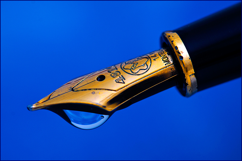
I'm not too happy with the "gold" color but I wanted it to be a solid contrast to the background.
The water drop instead of the ink was meant to support the title: a lost art. But I guess I over-thought that part.
THanks for all the good comments (11 as of Friday)
Statistics
Place: 4 out of 98 Avg (all users): 6.5415 Avg (commenters): 7.7143 Avg (participants): 6.2000 Avg (non-participants): 6.6375 Views since voting: 2063 Views during voting: 343 Votes: 205 Comments: 18 Favorites: 0
the details of texture on the gold head are really amazing, even doesnt look as real metal, and i think should have darker gradient background than that shiny solid bluish. 5
Lovely details in the tip. I am a bit confused why you went with a water drop instead of an ink drop (or at least but some blue food coloring in the water to make it appear like ink). Still, very nice overall.






 Add photograph to your favorites
 Add photographer to your favorites

 Photographer found comment helpful.


